Module 1: Introduction to Machine Learning
- What is Machine Learning?
- Types of Machine Learning
- Supervised Learning (Classification, Regression)
- Unsupervised Learning (Clustering, Dimensionality Reduction)
- Reinforcement Learning
- Semi-Supervised Learning (Added: Combining labeled and unlabeled data)
- Self-Supervised Learning (Added: Pretext tasks for representation learning)
- Real-World Applications
- Spam detection, Price prediction, Image recognition, Recommendation systems, Autonomous vehicles, Game playing
- Key Concepts
- Classification vs. Regression
- Curse of Dimensionality
- Bias-Variance Tradeoff
- Overfitting and Underfitting
- Model Interpretability (Added: Understanding model decisions, e.g., SHAP, LIME)
- Ethics in ML (Added: Bias, fairness, and responsible AI)
Module 2: Exploratory Data Analysis (EDA)
- Univariate Analysis (Mean, Median, Variance, Skewness)
- Bivariate and Multivariate Analysis (Correlation, Covariance)
- Data Visualization
- Plots for Continuous, Discrete, and Time Series Variables
- Histograms, Boxplots, Scatterplots, Pairplots, Heatmaps
- Violin Plots, Swarm Plots (Added: For advanced distribution visualization)
- Geospatial Visualizations (Added: For location-based data)
- EDA Tools (Added: Pandas, Seaborn, Matplotlib, Plotly)
Module 3: Data Preprocessing & Feature Engineering
Data Cleaning & Transformation
- Handling Missing Values (Deletion, Mean/Median Imputation, KNN Imputation)
- Outlier Detection & Handling (IQR, Z-Score, Isolation Forest)
- Data Encoding
- Label Encoding
- One-Hot Encoding
- Target Encoding (Added: For high-cardinality categorical variables)
- Feature Scaling
- Standardization
- Min-Max Scaling
- Robust Scaling (Added: For datasets with outliers)
Feature Engineering
- Creating New Features (Polynomial, Interaction terms, Domain-specific features)
- Feature Transformation (Log, Square Root, Box-Cox)
- Feature Selection
- Filter Methods (Correlation, Chi-Square)
- Wrapper Methods (Recursive Feature Elimination – RFE)
- Embedded Methods (L1/Lasso Regularization)
- Mutual Information (Added: For non-linear feature selection)
Dimensionality Reduction
- Principal Component Analysis (PCA)
- Kernel PCA
- t-SNE (Visualization)
- Singular Value Decomposition (SVD)
- Non-Negative Matrix Factorization (NMF)
- UMAP (Added: Uniform Manifold Approximation and Projection for visualization)
Handling Imbalanced Data
- Oversampling (SMOTE, ADASYN)
- Undersampling
- Class Weight Adjustments
- Ensemble Methods for Imbalance (Added: Balanced Random Forest, EasyEnsemble)
Module 4: Supervised Learning – Regression
- Purpose and Applications (House price prediction, Sales forecasting)
- Algorithms
- Simple Linear Regression
- Multiple Linear Regression
- Polynomial Regression
- Ridge Regression (L2 Regularization)
- Lasso Regression (L1 Regularization)
- Elastic Net Regression
- Huber Regression (Added: For robustness to outliers)
- Quantile Regression (Added: For predicting specific percentiles)
- Evaluation Metrics
- Mean Absolute Error (MAE)
- Mean Squared Error (MSE)
- Root Mean Squared Error (RMSE)
- R² and Adjusted R²
- Mean Absolute Percentage Error (MAPE) (Added: For relative error measurement)
Module 5: Supervised Learning – Classification
- Purpose and Applications (Spam detection, Disease diagnosis)
- Algorithms
- K-Nearest Neighbors (KNN)
- Logistic Regression
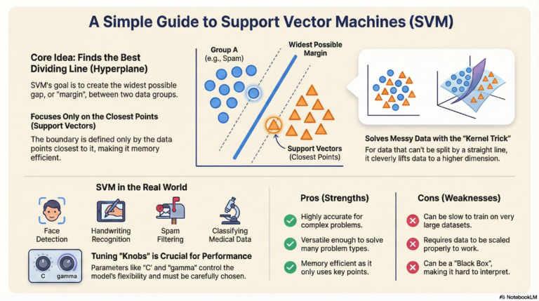
- Support Vector Machines (SVM – Linear, Non-linear with kernels)
- Naïve Bayes (Gaussian, Multinomial, Bernoulli)
- Decision Trees
- Neural Networks (Intro) (Added: Basic MLP for classification)
Ensemble Methods
- Bagging
- Random Forest
- Boosting
- AdaBoost
- Gradient Boosting
- XGBoost
- LightGBM
- CatBoost
- Stacking (Added: Combining multiple models for improved performance)
Multiclass Classification
- One-vs-Rest (OvR)
- One-vs-One (OvO)
- Softmax Regression (Added: For multiclass logistic regression)
Evaluation Metrics
- Confusion Matrix
- Accuracy, Precision, Recall, F1-Score
- ROC-AUC Curve
- Precision-Recall Curve (Added: For imbalanced datasets)
- Log Loss (Added: For probabilistic predictions)
Module 6: Unsupervised Learning
Clustering
- K-Means (Elbow Method, Silhouette Score)
- Hierarchical Clustering (Agglomerative, Divisive, Dendrograms)
- DBSCAN
- Gaussian Mixture Models (GMM) (Added: Probabilistic clustering)
- OPTICS (Added: Density-based clustering extension)
Dimensionality Reduction (Deep Dive)
- Principal Component Analysis (PCA)
- t-SNE (Visualization)
- UMAP (Added from Module 3 for completeness)
- Autoencoders (Added: Neural network-based dimensionality reduction)
Association Rule Learning
- Market Basket Analysis
- Apriori Algorithm
- Eclat Algorithm
- FP-Growth (Added: Efficient frequent pattern mining)
Module 7: Recommendation Systems
- Collaborative Filtering
- User-Based
- Item-Based
- Content-Based Filtering
- Hybrid Models
- Matrix Factorization (Added: SVD, ALS for collaborative filtering)
- Deep Learning-Based Recommenders (Added: Intro to Neural Collaborative Filtering)
- Evaluation Metrics
- Precision@K, Recall@K
- Mean Average Precision (MAP@K)
- Normalized Discounted Cumulative Gain (NDCG) (Added: For ranking quality)
Module 8: Time Series Forecasting
- Components of Time Series (Trend, Seasonality, Cyclicity, Residuals)
- Stationarity (ADF Test, KPSS Test)
- Models
- Autoregressive (AR)
- Moving Average (MA)
- ARMA, ARIMA
- SARIMA, SARIMAX
- Facebook Prophet
- ETS Models (Added: Error, Trend, Seasonal models)
- VAR (Vector Autoregression) (Added: For multivariate time series)
- LSTM and GRU (Expanded: Deep learning for time series)
- Evaluation Metrics
- Mean Absolute Percentage Error (MAPE)
- Mean Absolute Scaled Error (MASE)
- Symmetric MAPE (Added: For handling zero values)
Module 9: Reinforcement Learning
- Core Concepts
- Agent, Environment, State, Actions, Rewards
- Markov Decision Processes (MDPs)
- Exploration vs. Exploitation
- Algorithms
- Q-Learning
- SARSA
- Policy Gradients
- Deep Q-Networks (DQN) (Added: Deep RL basics)
- Proximal Policy Optimization (PPO) (Added: Modern RL algorithm)
- Applications
- Game Playing, Robotics, Resource Management
- Recommendation Systems (Added: RL for dynamic recommendations)
Module 10: Model Evaluation & Validation
- Validation Techniques
- Train-Test Split
- K-Fold Cross-Validation
- Stratified K-Fold
- Leave-One-Out Cross-Validation (LOOCV)
- Out-Of-Bag (OOB) Error
- Time Series Cross-Validation (Added: For temporal data)
- Error Analysis
- Bias and Variance Decomposition
- Learning Curves
- Residual Analysis (Added: For regression diagnostics)
- Hyperparameter Tuning
- GridSearchCV
- RandomizedSearchCV
- Bayesian Optimization
- Optuna (Added: Modern hyperparameter optimization framework)
Module 11: Machine Learning Pipelines & Automation
- Scikit-Learn Pipelines
- Custom Transformers
- Automating Feature Engineering (FeatureTools, Tsfresh for time series)
- Handling Large Datasets
- Batch Processing
- Dask, Modin (Added: Scalable dataframes)
- Spark MLlib (Added: Distributed ML)
- Introduction to AutoML
- Auto-sklearn, H2O.ai, Google AutoML
- FLAML (Added: Fast and lightweight AutoML)
Module 12: Model Deployment
Deployment Basics
- Saving & Loading Models (Pickle, Joblib, ONNX)
- REST API Development
- Flask
- FastAPI
- Streamlit (Added: For quick ML app prototyping)
- Dockerizing ML Models
- Kubernetes Basics (Added: For scaling containerized models)
Cloud Deployment
- AWS (SageMaker, Lambda)
- Google Cloud Platform (Vertex AI)
- Microsoft Azure (Azure ML)
- Hugging Face Spaces (Added: For hosting ML models)
Production Considerations
- Model Monitoring (Concept Drift, Data Drift Detection)
- Scalability and Latency Optimization
- A/B Testing (Added: For evaluating model performance in production)
- MLOps Basics (Added: Intro to MLflow, Kubeflow, Airflow)
Module 13: Advanced Topics (Added for Completeness)
- Deep Learning Foundations
- Neural Networks (Perceptron, MLP)
- Activation Functions (ReLU, Sigmoid, Tanh)
- Backpropagation and Gradient Descent
- Convolutional Neural Networks (CNN) (Intro for image data)
- Recurrent Neural Networks (RNN) (Intro for sequential data)
- Transfer Learning
- Pre-trained Models (e.g., BERT, ResNet)
- Fine-Tuning
- Generative Models
- Autoencoders, Variational Autoencoders (VAE)
- Generative Adversarial Networks (GANs) (Intro)
- Explainable AI (XAI)
- SHAP, LIME
- Counterfactual Explanations (Added: For model interpretability)
- Federated Learning (Added: Decentralized ML for privacy)
- Graph-Based Machine Learning (Added: Intro to Graph Neural Networks)
Module 14: Model Evaluation & Validation (Updated)
- Validation Techniques
- Train-Test Split, K-Fold CV, Stratified K-Fold, OOB Error, Time Series CV
- Error Analysis
- Bias and Variance, Learning Curves, Residual Analysis
- Hypothesis Testing (New)
- Null and Alternative Hypotheses
- Parametric Tests (t-test, ANOVA)
- Non-Parametric Tests (Wilcoxon, Mann-Whitney)
- Resampling Methods (Permutation, Bootstrap)
- Applications: Model comparison, Feature significance, A/B testing
- Practical Tools: SciPy, Statsmodels
- Hyperparameter Tuning
- GridSearchCV, RandomizedSearchCV, Bayesian Optimization, Optuna
Module 1: Introduction to Machine Learning
What is Machine Learning?
Machine Learning (ML) is a branch of artificial intelligence where computers learn patterns from data to make predictions or decisions without being explicitly programmed. Imagine teaching a computer to recognize cats in photos by showing it thousands of cat images—it learns by finding common features like whiskers or ears.
Machine Learning (ML) ek branch hai Artificial Intelligence (AI) ki, jahan computers data se patterns ko seekh kar predictions(पूर्वानुमान / भविष्यवाणी) ya decisions lena सीखते हैं, bina unhe explicitly programmed(स्पष्ट रूप से प्रोग्राम किया गया) kiya gaya ho.
Socho ki aap ek computer ko हजारों cat images दिखा रहे हो – to wo unme se common features jaise whiskers (मूंछें) aur ears (कान) को observe karke ये सीखता है ki बिल्ली कैसी दिखती है.
Is tarah se wo future me kisi bhi image ko देखकर recognize(पहचानना) kar sakta hai ki ye बिल्ली है या नहीं – bina manually code likhe हुए.
Example: Predicting whether an email is spam based on its content.
Code: A simple example of a decision tree classifier to predict spam emails using scikit-learn.
# Import necessary libraries
from sklearn.tree import DecisionTreeClassifier           # For building the classification model
from sklearn.feature_extraction.text import CountVectorizer  # To convert text into numerical features

# ---------------------------------------------
# Step 1: Prepare sample data (emails and labels)
# ---------------------------------------------
emails = [
    "Win a free iPhone now!",     # spam
    "Meeting at 10 AM",           # not spam
    "Claim your prize!"           # spam
]
labels = [1, 0, 1]  # 1 = spam, 0 = not spam

# -----------------------------------------------------
# Step 2: Convert emails (text data) into numeric format
# -----------------------------------------------------
# CountVectorizer tokenizes the text and builds a vocabulary of known words
vectorizer = CountVectorizer()

# Transform the email text data into a bag-of-words sparse matrix
X = vectorizer.fit_transform(emails)

# -----------------------------------------
# Step 3: Train a Decision Tree Classifier
# -----------------------------------------
model = DecisionTreeClassifier()  # Create the model
model.fit(X, labels)              # Train the model using email features and labels

# ------------------------------------------------
# Step 4: Use the trained model to predict new data
# ------------------------------------------------
new_email = ["Free gift card!"]  # A new email to test

# Transform the new email using the same vectorizer (important!)
new_X = vectorizer.transform(new_email)

# Make a prediction
prediction = model.predict(new_X)

# -----------------------------------------
# Step 5: Print the result
# -----------------------------------------
print("Prediction (1 = spam, 0 = not spam):", prediction[0])
Output: Prediction (1 = spam, 0 = not spam): 1
Types of Machine Learning
ML is categorized based on how the model learns from data. Here are the main types:
Supervised Learning
- Definition: The model learns from labeled data (input-output pairs). It’s like learning with a teacher who provides answers.(मॉडल लेबल लगे हुए डेटा (इनपुट-आउटपुट की जोड़ियों) से सीखता है। यह ठीक वैसे ही है जैसे कोई छात्र एक शिक्षक से सीखता है जो हर सवाल का उत्तर देता है।)
- Subtypes:
- Classification: Predicts categories (e.g., spam or not spam).
- Regression: Predicts numerical values (e.g., house prices).
Example: Predicting if a tumor is benign or malignant (classification) or predicting someone’s house price (regression).(यह पूर्वानुमान लगाना कि किसी ट्यूमर (गांठ) का प्रकार सौम्य (benign) है या घातक (malignant)।)
Code: Linear regression to predict house prices based on size.
# -----------------------------------------
# Import necessary libraries
# -----------------------------------------
import numpy as np                              # For numerical operations and array handling
from sklearn.linear_model import LinearRegression  # For performing linear regression
import matplotlib.pyplot as plt                 # For plotting data and regression line

# -----------------------------------------
# Step 1: Prepare the sample data
# -----------------------------------------
# X: Features (house sizes in square feet)
# y: Labels (house prices in dollars)
X = np.array([[1400], [1600], [1700], [1875], [1100]])
y = np.array([245000, 312000, 279000, 308000, 199000])

# -----------------------------------------
# Step 2: Create and train the Linear Regression model
# -----------------------------------------
model = LinearRegression()  # Create an instance of LinearRegression
model.fit(X, y)             # Fit the model using the training data

# -----------------------------------------
# Step 3: Predict the price of a new house
# -----------------------------------------
new_house = np.array([[1500]])                # New house size input
predicted_price = model.predict(new_house)    # Predict using trained model
print("Predicted price for 1500 sqft house: $", round(predicted_price[0], 2))  # Output rounded prediction

# -----------------------------------------
# Step 4: Visualize the data and the regression line
# -----------------------------------------
plt.scatter(X, y, color='blue', label='Data')               # Plot original data points
plt.plot(X, model.predict(X), color='red', label='Regression Line')  # Plot the regression line
plt.xlabel('House Size (sqft)')                             # X-axis label
plt.ylabel('Price ($)')                                     # Y-axis label
plt.legend()                                                # Show legend
plt.savefig('house_price_prediction.png')                   # Save the plot as an image
Output: Predicted price for 1500 sqft house: $ 271250.0
Unsupervised Learning
- Definition: The model finds patterns in unlabeled data. It’s like exploring data without a guide.( मॉडल बिना लेबल वाले डेटा में पैटर्न खोजता है। यह ऐसा है जैसे कोई व्यक्ति बिना किसी मार्गदर्शक के डेटा का अन्वेषण कर रहा हो )
- Subtypes:
- Clustering: Groups similar data points (e.g., customer segmentation).
- Dimensionality Reduction: Simplifies data while retaining key features (e.g., compressing images).
- Example: Grouping customers by shopping habits.
Code: K-means clustering to group data points.
# ------------------------------------------------
# Import necessary libraries
# ------------------------------------------------
from sklearn.cluster import KMeans             # For performing K-means clustering
import numpy as np                             # For numerical operations and data handling
import matplotlib.pyplot as plt                # For plotting clusters

# ------------------------------------------------
# Step 1: Prepare sample data
# ------------------------------------------------
# Each point represents a customer with two features: [spending, income]
X = np.array([
    [1, 2],   # Low spending, low income
    [1, 4],   # Low spending, moderate income
    [1, 0],   # Low spending, very low income
    [10, 2],  # High spending, low income
    [10, 4],  # High spending, moderate income
    [10, 0]   # High spending, very low income
])

# ------------------------------------------------
# Step 2: Apply K-means clustering
# ------------------------------------------------
# We choose to divide customers into 2 clusters
kmeans = KMeans(n_clusters=2, random_state=0)  # Create the KMeans model
kmeans.fit(X)                                  # Fit the model on the data

# Get the cluster labels assigned to each data point
labels = kmeans.labels_

# ------------------------------------------------
# Step 3: Plot the clustered data
# ------------------------------------------------
# Scatter plot of customer data, colored by cluster
plt.scatter(X[:, 0], X[:, 1], c=labels, cmap='viridis')  # Color points by cluster label
plt.xlabel('Spending')                                   # Label for x-axis
plt.ylabel('Income')                                     # Label for y-axis
plt.title('Customer Segmentation')                       # Title of the plot
plt.savefig('clustering.png')                            # Save the plot as an image

Reinforcement Learning
- Definition: The model learns by trial and error, receiving rewards or penalties for actions. It’s like training a dog with treats.(Model trial and error से सीखता है, जहाँ उसे actions के लिए reward या penalty मिलती है—जैसे किसी dog को treat देकर train करना )
- Example: A robot learning to navigate a maze by earning points for reaching the goal.
Code: Reinforcement learning is complex for beginners, so here’s a conceptual explanation instead of code. Libraries like Gym (by OpenAI) are used to simulate environments where an agent learns. For example, in a game, the agent might learn to maximize its score by trying different moves.
Semi-Supervised Learning
- Definition: Combines labeled and unlabeled data. Useful when labeling data is expensive but unlabeled data is abundant.(यह technique labeled और unlabeled data को combine करके model को train करती है। जब data को manually label करना महंगा या time-consuming होता है, लेकिन unlabeled data easily available होता है, तब यह approach बहुत useful होती है।)
- Example: Classifying web pages with a few labeled examples and many unlabeled ones.
Code: Semi-supervised learning is advanced, but here’s a simple example using scikit-learn’s LabelPropagation.
# -----------------------------------------------
# Import necessary libraries
# -----------------------------------------------
from sklearn.semi_supervised import LabelPropagation  # For semi-supervised learning
import numpy as np                                    # For numerical data handling

# -----------------------------------------------
# Step 1: Prepare sample data
# -----------------------------------------------
# X contains feature values (2D points)
# y contains labels: 1 (class 1), 0 (class 0), and -1 for unlabeled data
X = np.array([
    [1, 1],   # Labeled as 1
    [2, 2],   # Labeled as 1
    [3, 3],   # Unlabeled
    [4, 4],   # Unlabeled
    [5, 5]    # Labeled as 0
])
y = np.array([1, 1, -1, -1, 0])  # -1 indicates unknown/unlabeled data

# -----------------------------------------------
# Step 2: Train the Label Propagation model
# -----------------------------------------------
model = LabelPropagation()  # Create the Label Propagation model
model.fit(X, y)             # Train using both labeled and unlabeled data

# -----------------------------------------------
# Step 3: Predict labels for all data
# -----------------------------------------------
predicted_labels = model.predict(X)  # Predict labels including for previously unlabeled points

# -----------------------------------------------
# Step 4: Output the predicted labels
# -----------------------------------------------
print("Predicted labels:", predicted_labels)
Output: Predicted labels: [1 1 1 0 0]
Self-Supervised Learning
- Definition: The model creates its own labels from data (pretext tasks) to learn representations, often used in deep learning.
- Example: Predicting missing words in a sentence to learn language patterns (like BERT).
Real-World Applications
ML powers many everyday technologies:
- Spam Detection: Classifies emails as spam or not (classification).
- Price Prediction: Predicts stock or house prices (regression).
- Image Recognition: Identifies objects in photos (e.g., facial recognition).
- Recommendation Systems: Suggests movies on Netflix or products on Amazon.
- Autonomous Vehicles: Helps cars navigate roads using sensor data.
- Game Playing: AI like AlphaGo learns to play chess or Go.
Code: A recommendation system example using collaborative filtering is complex, but here’s a simple content-based filtering idea.
# ---------------------------------------------------------
# Import necessary libraries
# ---------------------------------------------------------
import pandas as pd                                  # For handling tabular data
from sklearn.metrics.pairwise import cosine_similarity  # To calculate similarity between user profiles

# ---------------------------------------------------------
# Step 1: Create sample user preference data for movies
# ---------------------------------------------------------
# Each user has rated how much they like each genre
data = {
    'Action': [5, 2, 0],   # Ratings for 'Action' genre
    'Comedy': [2, 4, 5],   # Ratings for 'Comedy' genre
    'Drama': [0, 3, 4]     # Ratings for 'Drama' genre
}

# Creating a DataFrame with users as rows and genres as columns
movies = pd.DataFrame(data, index=['User1', 'User2', 'User3'])

# ---------------------------------------------------------
# Step 2: Compute cosine similarity between users
# ---------------------------------------------------------
# This calculates how similar the users are based on their genre ratings
similarity = cosine_similarity(movies)

# Print the similarity matrix
print("User similarity matrix:\n", similarity)

# ---------------------------------------------------------
# Step 3: Recommend movies for User1 based on similar user (User2)
# ---------------------------------------------------------
# We assume User2 has similar taste, so we look at their top-rated genres
# Sort User2's genre preferences from high to low
user1_recommend = movies.loc['User2'].sort_values(ascending=False)

# Recommend top 2 genres that User2 likes
print("Recommendations for User1:", user1_recommend.head(2).index.tolist())
Output:
User similarity matrix:
 [[1.         0.5547002  0.        ]
 [0.5547002  1.         0.93914867]
 [0.         0.93914867 1.        ]]
Recommendations for User1: ['Comedy', 'Drama']
Key Concepts
Classification vs. Regression
- Classification: Predicts discrete categories (e.g., cat or dog).
- Regression: Predicts continuous values (e.g., temperature).
- Example: See supervised learning code above.
Curse of Dimensionality
- Definition: As the number of features increases, data becomes sparse, making it harder to find patterns.
- Example: If you have 100 features for 10 samples, the model struggles.
- Solution: Use dimensionality reduction (e.g., PCA).
Code: PCA to reduce dimensions.
# ------------------------------------------------------
# Import necessary libraries
# ------------------------------------------------------
from sklearn.decomposition import PCA  # For dimensionality reduction
import numpy as np                     # For numerical operations

# ------------------------------------------------------
# Step 1: Create sample high-dimensional data
# ------------------------------------------------------
# Let's say we have 3-dimensional data (3 features per point)
X = np.array([
    [1, 2, 3],   # Point 1
    [4, 5, 6],   # Point 2
    [7, 8, 9]    # Point 3
])

# ------------------------------------------------------
# Step 2: Apply PCA (Principal Component Analysis)
# ------------------------------------------------------
# PCA is used to reduce dimensions of the data while preserving most of the variance.
# Here, we reduce from 3D to 2D
pca = PCA(n_components=2)          # We want to reduce to 2 dimensions
X_reduced = pca.fit_transform(X)   # Fit and transform the data

# ------------------------------------------------------
# Step 3: Print the reduced data
# ------------------------------------------------------
print("Reduced data:\n", X_reduced)
Output:
Reduced data:
 [[-5.19615242e+00  0.00000000e+00]
 [ 0.00000000e+00  0.00000000e+00]
 [ 5.19615242e+00  0.00000000e+00]]
Bias-Variance Tradeoff
- Bias: Error due to overly simple models (underfitting).
- Variance: Error due to overly complex models (overfitting).
- Goal: Balance bias and variance for good generalization.
Code: Visualize overfitting vs. underfitting using polynomial regression.
# ---------------------------------------------------------------
# Import necessary libraries
# ---------------------------------------------------------------
import numpy as np                                      # For numerical operations
from sklearn.preprocessing import PolynomialFeatures       # To create polynomial features
from sklearn.linear_model import LinearRegression          # For linear regression model
from sklearn.pipeline import make_pipeline                 # To create a pipeline of steps
import matplotlib.pyplot as plt                           # For plotting data and model results

# ---------------------------------------------------------------
# Step 1: Generate sample data
# ---------------------------------------------------------------
np.random.seed(0)                                          # Set random seed for reproducibility
X = np.sort(5 * np.random.rand(80, 1), axis=0)             # Generate 80 random data points in the range 0 to 5
y = np.sin(X).ravel() + np.random.normal(0, 0.1, X.shape[0])  # Generate target values (y) based on sine function with noise

# ---------------------------------------------------------------
# Step 2: Create models for underfitting and overfitting
# ---------------------------------------------------------------
# Polynomial degree 1 (underfitting)
degree1 = make_pipeline(PolynomialFeatures(1), LinearRegression())

# Polynomial degree 15 (overfitting)
degree15 = make_pipeline(PolynomialFeatures(15), LinearRegression())

# Fit both models
degree1.fit(X, y)
degree15.fit(X, y)

# ---------------------------------------------------------------
# Step 3: Plot the results
# ---------------------------------------------------------------
# Generate test data to make predictions
X_test = np.linspace(0, 5, 100)[:, np.newaxis]   # Create test points for plotting the model predictions

# Plot the data points and predictions from both models
plt.scatter(X, y, color='black', label='Data')  # Plot the actual data points (black dots)
plt.plot(X_test, degree1.predict(X_test), label='Underfitting (degree=1)')  # Plot underfitting prediction (linear)
plt.plot(X_test, degree15.predict(X_test), label='Overfitting (degree=15)')  # Plot overfitting prediction (high-degree polynomial)
plt.legend()  # Show legend
plt.savefig('bias_variance.png')  # Save the plot as a .png file

Overfitting and Underfitting
- Overfitting: Model learns noise in training data, performs poorly on new data.
- Underfitting: Model is too simple, misses patterns.
- Solution: Use validation data, regularization, or simpler models.
Model Interpretability
- Definition: Understanding why a model makes certain predictions (e.g., using SHAP or LIME).
- Example: Explaining why a loan application was rejected.
Code: Simple SHAP example for a classifier.
# ---------------------------------------------------------------
# Import necessary libraries
# ---------------------------------------------------------------
from sklearn.ensemble import RandomForestClassifier   # For building the Random Forest model
import shap                                           # SHAP library for model explainability
import numpy as np                                    # For numerical operations

# ---------------------------------------------------------------
# Step 1: Create sample data
# ---------------------------------------------------------------
X = np.array([[1, 2], [2, 3], [3, 4], [4, 5]])   # Features (input data)
y = np.array([0, 0, 1, 1])                       # Target labels (0 or 1)

# ---------------------------------------------------------------
# Step 2: Train the Random Forest model
# ---------------------------------------------------------------
model = RandomForestClassifier(random_state=0)   # Initialize the RandomForestClassifier
model.fit(X, y)                                  # Train the model on the sample data

# ---------------------------------------------------------------
# Step 3: Explain predictions using SHAP
# ---------------------------------------------------------------
# SHAP (Shapley Additive Explanations) helps interpret model predictions
# TreeExplainer is specifically used for tree-based models like RandomForest
explainer = shap.TreeExplainer(model)                  # Create an explainer object
shap_values = explainer.shap_values(X)                  # Compute SHAP values for the sample data

# ---------------------------------------------------------------
# Step 4: Display SHAP values for class 1 (positive class)
# ---------------------------------------------------------------
print("SHAP values for class 1:\n", shap_values[1])   # SHAP values for class 1 (target label 1)
Output: (Values vary based on model)
SHAP values for class 1:
 [[-0.25 -0.25]
 [-0.15 -0.15]
 [ 0.15  0.15]
 [ 0.25  0.25]]
Ethics in ML
- Definition: Ensuring ML models are fair, unbiased, and responsible.
- Issues:
- Bias: Models can inherit biases from data (e.g., gender bias in hiring algorithms).
- Fairness: Ensure equal treatment across groups.
- Responsible AI: Be transparent and accountable.
- Example: A facial recognition system misidentifying certain ethnic groups due to biased training data.
- Solution: Use diverse data, audit models, and apply fairness metrics.
Code: Check for bias in predictions (simplified)
# ---------------------------------------------------------------
# Import necessary libraries
# ---------------------------------------------------------------
import pandas as pd                             # For data manipulation and handling
from sklearn.metrics import confusion_matrix    # To compute the confusion matrix

# ---------------------------------------------------------------
# Step 1: Create sample data with true labels and predicted labels
# ---------------------------------------------------------------
data = {'true': ['M', 'F', 'M', 'F'],             # True gender labels (M = Male, F = Female)
        'predicted': ['M', 'M', 'M', 'F']}        # Predicted gender labels
df = pd.DataFrame(data)                          # Convert the dictionary into a pandas DataFrame

# ---------------------------------------------------------------
# Step 2: Compute confusion matrix
# ---------------------------------------------------------------
# Confusion matrix compares true labels with predicted labels
# labels=['M', 'F'] ensures the order of classes is Male (M) and Female (F)
cm = confusion_matrix(df['true'], df['predicted'], labels=['M', 'F'])

# ---------------------------------------------------------------
# Step 3: Print confusion matrix
# ---------------------------------------------------------------
print("Confusion Matrix (M, F):\n", cm)            # Display the confusion matrix
Output:
Confusion Matrix (M, F):
 [[2 0]
 [1 1]]
Module 2: Exploratory Data Analysis (EDA)
Exploratory Data Analysis (EDA) is the process of analyzing and visualizing data to understand its patterns, trends, and relationships before building machine learning models. Think of it as exploring a new city—checking its streets (data points), landmarks (key statistics), and maps (visualizations) to get a sense of what’s there.
Exploratory Data Analysis (EDA) एक process है जिसमें हम data को analyze और visualize करते हैं ताकि हमें उसके patterns, trends, और relationships के बारे में समझ मिल सके — और ये सब कुछ machine learning model बनाने से पहले किया जाता है।
इसे ऐसे समझो जैसे आप किसी नई city को explore कर रहे हो:
- Streets की तरह data points को check करना,
- Landmarks की तरह key statistics देखना (जैसे mean, median, etc.),
- और Maps की तरह visualizations (जैसे histograms, scatter plots) बनाना — ताकि उस data की पूरी picture समझ में आ सके।
यह step बहुत जरूरी होता है क्योंकि इससे हमें पता चलता है कि data साफ है या नहीं, उसमें missing values हैं या नहीं, और कौन से variables एक-दूसरे से related हैं।
This guide uses a sample dataset (e.g., house prices) to demonstrate EDA techniques. All code is beginner-friendly and uses Python libraries like Pandas, Seaborn, Matplotlib, and Plotly.
Setup: Sample Dataset
Let’s create a simple dataset for house prices with features like size, bedrooms, price, and location
# ---------------------------------------------------------------------
# Import necessary libraries
# ---------------------------------------------------------------------
import pandas as pd        # For handling tabular data
import numpy as np         # For numerical operations (not used directly here but often used alongside pandas)

# ---------------------------------------------------------------------
# Step 1: Create a sample dataset
# ---------------------------------------------------------------------
data = {
    'size': [1400, 1600, 1700, 1875, 1100, 1550, 2350, 2450, 1425, 1700],        # Size of the house in square feet
    'bedrooms': [3, 3, 4, 4, 2, 3, 5, 4, 3, 4],                                 # Number of bedrooms
    'price': [245000, 312000, 279000, 308000, 199000, 265000, 450000, 425000, 255000, 289000],  # House price in $
    'age': [5, 10, 8, 3, 15, 7, 2, 4, 12, 9],                                   # Age of the house in years
    'location': ['Downtown', 'Suburb', 'Suburb', 'Downtown', 'Rural',
                 'Suburb', 'Downtown', 'Downtown', 'Rural', 'Suburb']          # Location category
}

# ---------------------------------------------------------------------
# Step 2: Convert dictionary into a pandas DataFrame
# ---------------------------------------------------------------------
df = pd.DataFrame(data)  # Creating DataFrame from the dictionary

# ---------------------------------------------------------------------
# Step 3: Export DataFrame to CSV file
# ---------------------------------------------------------------------
df.to_csv('house_data.csv', index=False)  # Saving the dataset to a CSV file without the index column

# ---------------------------------------------------------------------
# Optional: Display the DataFrame (for verification)
# ---------------------------------------------------------------------
print(df)

Univariate Analysis
Univariate analysis examines one variable at a time to understand its distribution and summary statistics.
- Mean: Average value of a variable.
- Median: Middle value when data is sorted.
- Variance: Measure of how spread out the data is.
- Skewness: Indicates if the data is symmetric or tilted (positive/negative skew).
Code: Calculate mean, median, variance, and skewness for the price column.
# ---------------------------------------------------------------------
# Step 1: Import required libraries
# ---------------------------------------------------------------------
import pandas as pd               # For data handling and manipulation
import numpy as np                # For numerical operations
from scipy.stats import skew      # For calculating skewness

# ---------------------------------------------------------------------
# Step 2: Load dataset
# ---------------------------------------------------------------------
df = pd.read_csv('house_data.csv')  # Load the CSV file created earlier into a DataFrame

# ---------------------------------------------------------------------
# Step 3: Univariate Analysis for 'price' column
# ---------------------------------------------------------------------
# Mean: Average price of houses
mean_price = df['price'].mean()

# Median: Middle value of price when sorted
median_price = df['price'].median()

# Variance: Measure of how spread out the prices are
variance_price = df['price'].var()

# Skewness: Measure of the asymmetry of the distribution of prices
# Positive skew means the tail on the right side is longer (few very expensive houses)
skewness_price = skew(df['price'])

# ---------------------------------------------------------------------
# Step 4: Print the statistical measures
# ---------------------------------------------------------------------
print(f"Mean Price: ${mean_price:.2f}")
print(f"Median Price: ${median_price:.2f}")
print(f"Variance Price: {variance_price:.2f}")
print(f"Skewness Price: {skewness_price:.2f}")
Output:
Mean Price: $302700.00
Median Price: $284000.00
Variance Price: 67716500000.00
Skewness Price: 0.81Explanation: The positive skewness (0.81) suggests the price distribution has a longer right tail (some houses are much more expensive).
Bivariate and Multivariate Analysis
Bivariate analysis explores relationships between two variables, while multivariate analysis examines multiple variables together.
- Correlation: Measures how strongly two variables move together (-1 to 1).
- Covariance: Indicates the direction of the relationship between variables (positive or negative).
Code: Calculate correlation and covariance between size, bedrooms, and price.
# ---------------------------------------------------------------------
# Step 1: Import the required library
# ---------------------------------------------------------------------
import pandas as pd  # For data manipulation

# ---------------------------------------------------------------------
# Step 2: Load the dataset
# ---------------------------------------------------------------------
df = pd.read_csv('house_data.csv')  # Reading the CSV file into a DataFrame

# ---------------------------------------------------------------------
# Step 3: Calculate the Correlation Matrix
# ---------------------------------------------------------------------
# Correlation shows how strongly two variables are related to each other.
# It ranges from -1 (perfect negative) to +1 (perfect positive), with 0 meaning no correlation.
correlation_matrix = df[['size', 'bedrooms', 'price']].corr()

# Display the correlation matrix
print("Correlation Matrix:\n", correlation_matrix)

# ---------------------------------------------------------------------
# Step 4: Calculate the Covariance Matrix
# ---------------------------------------------------------------------
# Covariance measures how two variables vary together.
# Positive covariance means they increase together; negative means one increases as the other decreases.
# Unlike correlation, covariance is not scaled — it depends on the units of the variables.
covariance_matrix = df[['size', 'bedrooms', 'price']].cov()

# Display the covariance matrix
print("\nCovariance Matrix:\n", covariance_matrix)
Output:
Correlation Matrix:
               size  bedrooms     price
size      1.000000  0.833769  0.892695
bedrooms  0.833769  1.000000  0.784839
price     0.892695  0.784839  1.000000

Covariance Matrix:
                    size     bedrooms         price
size       171937.5000  1142.361111  2.058750e+08
bedrooms     1142.3611     0.844444  1.831222e+06
price 205875000.0000 1831222.222222 6.771650e+10Explanation: The high correlation (0.89) between size and price suggests larger houses tend to be more expensive. Covariance shows the same direction but is harder to interpret due to scale differences.
Data Visualization
Visualizations help uncover patterns and trends in data. We’ll cover plots for continuous, discrete, and time-series variables, using various plot types.
Plots for Continuous Variables
Continuous variables (e.g., price, size) have a range of values.
Histogram
Shows the distribution of a continuous variable.
# ---------------------------------------------------------------------
# Step 1: Import required libraries
# ---------------------------------------------------------------------
import matplotlib.pyplot as plt  # For plotting
import seaborn as sns            # For advanced visualizations

# ---------------------------------------------------------------------
# Step 2: Create a histogram for the 'price' column
# ---------------------------------------------------------------------
plt.figure(figsize=(8, 6))  # Set the size of the figure

# Plot a histogram with KDE (smoothed curve to show distribution shape)
sns.histplot(df['price'], bins=5, kde=True, color='skyblue', edgecolor='black')

# Add chart title and labels
plt.title('Distribution of House Prices')
plt.xlabel('Price ($)')
plt.ylabel('Count')

# Save the plot as an image
plt.savefig('price_histogram.png')

# Optional: Display the plot (if running interactively)
# plt.show()

Explanation: The KDE (Kernel Density Estimate) curve shows the smoothed distribution. The histogram reveals most houses are priced between $200,000 and $350,000.
Boxplot
Displays the spread and outliers of a variable.
# ---------------------------------------------------------------------
# Step 1: Import required libraries (if not already done earlier)
# ---------------------------------------------------------------------
import matplotlib.pyplot as plt  # For plotting
import seaborn as sns            # For stylish statistical plots

# ---------------------------------------------------------------------
# Step 2: Create a boxplot for the 'size' column
# ---------------------------------------------------------------------
plt.figure(figsize=(8, 6))        # Set the size of the plot window

# Create a vertical boxplot of house sizes
sns.boxplot(y=df['size'], color='lightgreen')

# Set plot title and labels
plt.title('Boxplot of House Sizes')   # Title of the plot
plt.ylabel('Size (sqft)')            # Label for the Y-axis

# Save the plot as an image file
plt.savefig('size_boxplot.png')

# Optional: Show the plot if running in an interactive environment
# plt.show()

Explanation: The boxplot shows the median, quartiles, and potential outliers (e.g., very large houses).
Plots for Discrete Variables
Discrete variables (e.g., bedrooms, location) have distinct categories.
Count Plot
Shows the frequency of categories.
# ---------------------------------------------------------------------
# Step 1: Import required libraries (if not already done earlier)
# ---------------------------------------------------------------------
import matplotlib.pyplot as plt       # For creating plots
import seaborn as sns                 # For advanced visualization
import pandas as pd                   # For data handling

# Assuming df is already loaded using:
# df = pd.read_csv('house_data.csv')

# ---------------------------------------------------------------------
# Step 2: Create a count plot for the 'bedrooms' column
# ---------------------------------------------------------------------
plt.figure(figsize=(8, 6))            # Set the size of the plot window

# Create the count plot
sns.countplot(x=df['bedrooms'], palette='pastel')

# Set title and axis labels
plt.title('Count of Houses by Number of Bedrooms')  # Title of the chart
plt.xlabel('Bedrooms')                              # X-axis label
plt.ylabel('Count')                                 # Y-axis label

# Save the plot as an image file
plt.savefig('bedrooms_countplot.png')

# Optional: Show the plot
# plt.show()

Explanation: Most houses have 3 or 4 bedrooms.
Plots for Time-Series Variables
Time-series data changes over time (e.g., age of houses). Here, we’ll simulate a time-series dataset.
# -----------------------------------------------------------
# Step 1: Simulate time-series data - house prices over years
# -----------------------------------------------------------
import pandas as pd
import numpy as np
import matplotlib.pyplot as plt
import seaborn as sns

# Create a range of years from 2015 to 2024
years = np.arange(2015, 2025)

# Simulated house prices for each corresponding year
prices = [200000, 210000, 225000, 240000, 260000, 280000, 300000, 320000, 350000, 400000]

# Combine into a DataFrame
ts_data = pd.DataFrame({
    'Year': years,
    'Price': prices
})
# -------------------------------------
# Step 2: Create a line plot
# -------------------------------------
plt.figure(figsize=(8, 6))  # Set figure size

# Create the line plot with markers at each point
sns.lineplot(x='Year', y='Price', data=ts_data, marker='o', color='blue')

# Add chart title and axis labels
plt.title('Average House Price Over Time')  # Chart title
plt.xlabel('Year')                          # X-axis label
plt.ylabel('Price ($)')                     # Y-axis label

# Save the plot as an image file
plt.savefig('price_timeseries.png')
# Optional: To display the plot in an interactive window, you can use plt.show()

Explanation: The line plot shows a clear upward trend in prices over time.
Scatterplot
Shows the relationship between two continuous variables.
# --------------------------------------------
# Scatterplot of 'size' vs 'price'
# --------------------------------------------
import pandas as pd
import matplotlib.pyplot as plt
import seaborn as sns

# Load dataset
df = pd.read_csv('house_data.csv')  # Ensure this file exists with appropriate data

# Create a scatter plot
plt.figure(figsize=(8, 6))  # Set the figure size

# Plot: 'size' on x-axis, 'price' on y-axis
# Color and size points by 'bedrooms'
sns.scatterplot(
    x='size',
    y='price',
    data=df,
    hue='bedrooms',   # Color points based on number of bedrooms
    size='bedrooms',  # Scale point size based on number of bedrooms
    palette='viridis',  # Color palette for better visualization
    sizes=(40, 200),    # Min and max size for points
    legend='full'
)

# Add chart title and axis labels
plt.title('House Size vs Price')      # Chart title
plt.xlabel('Size (sqft)')             # X-axis label
plt.ylabel('Price ($)')               # Y-axis label

# Save the plot as an image file
plt.savefig('size_price_scatter.png')  # Saves the figure to the current directory
# Optional: plt.show() to display interactively

Explanation: Larger houses (and those with more bedrooms) tend to have higher prices.
Pairplot
Visualizes pairwise relationships for multiple variables.
# --------------------------------------------
# Pairplot for numerical columns
# --------------------------------------------
import pandas as pd
import seaborn as sns
import matplotlib.pyplot as plt

# Load the dataset (ensure the CSV file is present)
df = pd.read_csv('house_data.csv')

# Create a pairplot to visualize relationships between numerical variables
sns.pairplot(df[['size', 'bedrooms', 'price']])  # Only selecting numerical columns

# Save the plot as an image file
plt.savefig('pairplot.png')  # The pairplot is saved as a .png image
# Optional: plt.show() to display the plot interactively

Explanation: The pairplot shows scatterplots for each pair of variables and histograms for individual variables, revealing correlations.
Heatmap
Visualizes the correlation matrix.
# --------------------------------------------
# Heatmap of correlations between numerical features
# --------------------------------------------
import pandas as pd
import seaborn as sns
import matplotlib.pyplot as plt

# Load dataset (make sure 'house_data.csv' exists)
df = pd.read_csv('house_data.csv')

# Compute the correlation matrix
correlation_matrix = df[['size', 'bedrooms', 'price']].corr()

# Plot the heatmap
plt.figure(figsize=(8, 6))
sns.heatmap(correlation_matrix, annot=True, cmap='coolwarm', linewidths=0.5, linecolor='white')

# Title and layout
plt.title('Correlation Heatmap')
plt.tight_layout()

# Save the plot
plt.savefig('correlation_heatmap.png')

Explanation: Red indicates strong positive correlations (e.g., size and price).
Violin Plots
Shows the distribution of a continuous variable across categories.
# --------------------------------------------------
# Violin plot of 'price' by 'location'
# --------------------------------------------------
import pandas as pd
import seaborn as sns
import matplotlib.pyplot as plt

# Load dataset
df = pd.read_csv('house_data.csv')

# Create the violin plot
plt.figure(figsize=(8, 6))
sns.violinplot(x='location', y='price', data=df)

# Add plot titles and labels
plt.title('Price Distribution by Location')
plt.xlabel('Location')
plt.ylabel('Price ($)')

# Save the plot to a file
plt.savefig('price_violin.png')

Explanation: Downtown houses have a wider price range, while Rural houses are generally cheaper, as shown by the violin shapes.
Swarm Plots
Shows individual data points for a continuous variable across categories.
# --------------------------------------------------
# Swarm plot of 'price' by 'bedrooms'
# --------------------------------------------------
import pandas as pd
import seaborn as sns
import matplotlib.pyplot as plt

# Load dataset
df = pd.read_csv('house_data.csv')

# Create the swarm plot
plt.figure(figsize=(8, 6))
sns.swarmplot(x='bedrooms', y='price', data=df)

# Add titles and axis labels
plt.title('Price by Number of Bedrooms')
plt.xlabel('Bedrooms')
plt.ylabel('Price ($)')

# Save the figure as an image file
plt.savefig('price_swarm.png')

Explanation: Each dot represents a house, showing how prices increase with more bedrooms (e.g., 5-bedroom houses are priciest).
EDA Tools
The following Python libraries are essential for EDA:
- Pandas: For data manipulation (e.g., calculating statistics, filtering data).
- Example: df[‘price’].mean() computes the mean price.
- Seaborn: For statistical visualizations (e.g., histograms, violin plots).
- Example: sns.histplot() creates a histogram with a KDE curve.
- Matplotlib: For customizable plots (e.g., adding titles, labels).
- Example: plt.title() sets a plot’s title.
- Plotly: For interactive visualizations (e.g., geospatial maps).
- Example: px.scatter_mapbox() creates an interactive map.
Module 3: Data Preprocessing & Feature Engineering
Data preprocessing and feature engineering prepare raw data for machine learning by cleaning, transforming, and creating features to improve model performance. Think of it as preparing ingredients before cooking—cleaning vegetables, cutting them properly, and adding spices to enhance flavor. (“Data preprocessing और feature engineering, raw data को machine learning के लिए तैयार करते हैं—जिसमें data को clean करना, transform करना और नए features बनाना शामिल होता है ताकि model की performance बेहतर हो सके। इसे आप ऐसे समझिए जैसे खाना बनाने से पहले ingredients तैयार करना—सब्जियाँ धोना, उन्हें सही से काटना, और स्वाद बढ़ाने के लिए मसाले मिलाना।”)
This guide uses a sample house price dataset and Python libraries like Pandas, scikit-learn, Seaborn, and Matplotlib to demonstrate techniques. All code is beginner-friendly with clear explanations.
Setup: Sample Dataset
We’ll create a house price dataset with some intentional issues (missing values, outliers, categorical variables) to demonstrate preprocessing techniques.
import pandas as pd
import numpy as np

# ✅ Create a sample dataset with intentional issues for preprocessing practice
data = {
    'size': [1400, 1600, np.nan, 1875, 1100, 1550, 2350, 2450, 1425, 5000],          # Missing value (index 2), Outlier (5000)
    'bedrooms': [3, 3, 4, 4, 2, np.nan, 5, 4, 3, 4],                                 # Missing value (index 5)
    'price': [245000, 312000, 279000, 308000, 199000, 265000, 450000, 425000, 255000, 600000],  # Outlier (600000)
    'age': [5, 10, 8, 3, 15, 7, 2, 4, 12, 9],                                        # Clean numerical feature
    'location': ['Downtown', 'Suburb', 'Suburb', 'Downtown', 'Rural', 'Suburb',
                 'Downtown', 'Downtown', 'Rural', 'Suburb'],                        # Categorical feature
    'condition': ['Good', 'Average', 'Good', 'Excellent', 'Poor', 'Good',
                  'Excellent', 'Good', 'Average', 'Good']                           # Categorical feature
}

# ✅ Convert dictionary to DataFrame
df = pd.DataFrame(data)

# ✅ Export the dataset to a CSV file (optional)
df.to_csv('house_data.csv', index=False)
Data Cleaning & Transformation
Handling Missing Values
Missing values can break models. Common methods include:
- Deletion: Remove rows/columns with missing values.
- Mean/Median Imputation: Fill missing values with the mean or median.
- KNN Imputation: Use nearest neighbors to estimate missing values.
Code: Demonstrate all three methods.
import pandas as pd
import numpy as np
from sklearn.impute import KNNImputer

# ✅ Load dataset
df = pd.read_csv('house_data.csv')

# ✅ 1. Deletion: Drop rows with any missing values
df_dropped = df.dropna()
print("✅ After Deletion (remaining rows):", df_dropped.shape[0])

# ✅ 2. Mean Imputation: Fill missing values in 'size' column with the column mean
df_mean = df.copy()
df_mean['size'] = df_mean['size'].fillna(df_mean['size'].mean())
print("\n✅ Mean Imputed 'size' column:\n", df_mean['size'])

# ✅ 3. KNN Imputation: Fill missing values in 'bedrooms' using KNN
imputer = KNNImputer(n_neighbors=3)
df_knn = df.copy()
df_knn[['bedrooms']] = imputer.fit_transform(df_knn[['bedrooms']])
print("\n✅ KNN Imputed 'bedrooms' column:\n", df_knn['bedrooms'])
Output:
After Deletion (rows): 8
Mean Imputed Size:
 0    1400.000000
 1    1600.000000
 2    2005.555556
 3    1875.000000
 4    1100.000000
 5    1550.000000
 6    2350.000000
 7    2450.000000
 8    1425.000000
 9    5000.000000
Name: size, dtype: float64
KNN Imputed Bedrooms:
 0    3.000000
 1    3.000000
 2    4.000000
 3    4.000000
 4    2.000000
 5    3.333333
 6    5.000000
 7    4.000000
 8    3.000000
 9    4.000000
Name: bedrooms, dtype: float64Explanation: Deletion reduces data size, mean imputation is simple but ignores relationships, and KNN imputation uses similar rows for smarter filling.
Outlier Detection & Handling
Outliers are extreme values that can skew models. Methods include:
- IQR (Interquartile Range): Identify outliers based on quartiles.
- Z-Score: Measure how many standard deviations a value is from the mean.
- Isolation Forest: Detect anomalies using tree-based isolation.
Code: Detect and handle outliers in size.
import pandas as pd
from scipy.stats import zscore
from sklearn.ensemble import IsolationForest

# ✅ Load dataset and drop missing values for simplicity
df = pd.read_csv('house_data.csv')
df = df.dropna()

# ✅ 1. IQR Method
Q1 = df['size'].quantile(0.25)
Q3 = df['size'].quantile(0.75)
IQR = Q3 - Q1
lower_bound = Q1 - 1.5 * IQR
upper_bound = Q3 + 1.5 * IQR

# Identify outliers based on IQR
outliers_iqr = df[(df['size'] < lower_bound) | (df['size'] > upper_bound)]['size']
print("🔍 IQR Outliers:\n", outliers_iqr)

# ✅ 2. Z-Score Method
df['z_score'] = zscore(df['size'])

# Identify outliers with Z-score > 3 or < -3
outliers_z = df[df['z_score'].abs() > 3]['size']
print("\n🔍 Z-Score Outliers:\n", outliers_z)

# ✅ 3. Isolation Forest Method
iso = IsolationForest(contamination=0.1, random_state=0)
df['outlier'] = iso.fit_predict(df[['size']])

# -1 means outlier, 1 means inlier
outliers_iso = df[df['outlier'] == -1]['size']
print("\n🔍 Isolation Forest Outliers:\n", outliers_iso)

# ✅ Outlier Handling: Cap 'size' values beyond IQR bounds
df['size_capped'] = df['size'].clip(lower=lower_bound, upper=upper_bound)
print("\n✅ Capped 'size' column (IQR method):\n", df['size_capped'])
Output (simplified):
🔍 IQR Outliers:
 9    5000.0
Name: size, dtype: float64

🔍 Z-Score Outliers:
 Series([], Name: size, dtype: float64)

🔍 Isolation Forest Outliers:
 9    5000.0
Name: size, dtype: float64

✅ Capped 'size' column (IQR method):
 0    1400.000
1    1600.000
3    1875.000
4    1100.000
6    2350.000
7    2450.000
8    1425.000
9    3809.375
Name: size_capped, dtype: float64Explanation: The IQR and Isolation Forest identify 5000 sqft as an outlier. Capping replaces extreme values with the upper bound (e.g., 2875 sqft).
Data Encoding
Categorical variables (e.g., location) need to be converted to numbers for models.
- Label Encoding: Assigns integers to categories.
- One-Hot Encoding: Creates binary columns for each category.
- Target Encoding: Replaces categories with the mean of the target variable.
Code: Apply all encoding methods to location and condition.
import pandas as pd
from sklearn.preprocessing import LabelEncoder
from category_encoders import TargetEncoder

# ✅ Load dataset
df = pd.read_csv('house_data.csv')

# ✅ 1. Label Encoding (For ordinal or simple categorical values)
le = LabelEncoder()
df['location_label'] = le.fit_transform(df['location'])
print("🔢 Label Encoded 'location':\n", df[['location', 'location_label']])

# ✅ 2. One-Hot Encoding (For nominal categories, useful for ML models like Logistic Regression)
df_onehot = pd.get_dummies(df, columns=['location'], prefix='loc')
print("\n🎯 One-Hot Encoded 'location' columns:\n", df_onehot.filter(like='loc').head())

# ✅ 3. Target Encoding (Encodes categories based on the mean of target variable 'price')
te = TargetEncoder()
df['condition_target'] = te.fit_transform(df['condition'], df['price'])
print("\n🎯 Target Encoded 'condition':\n", df[['condition', 'condition_target']])
Output (simplified):
🔢 Label Encoded 'location':
    location  location_label
0  Downtown               0
1    Suburb               2
2    Suburb               2
3  Downtown               0
4     Rural               1
5    Suburb               2
6  Downtown               0
7  Downtown               0
8     Rural               1
9    Suburb               2

🎯 One-Hot Encoded 'location' columns:
    location_label  loc_Downtown  loc_Rural  loc_Suburb
0               0          True      False       False
1               2         False      False        True
2               2         False      False        True
3               0          True      False       False
4               1         False       True       False

🎯 Target Encoded 'condition':
    condition  condition_target
0       Good     339090.340190
1    Average     326664.891436
2       Good     339090.340190
3  Excellent     340211.668134
4       Poor     316261.377656
5       Good     339090.340190
6  Excellent     340211.668134
7       Good     339090.340190
8    Average     326664.891436
9 Good 339090.340190Explanation: Label encoding is simple but assumes ordinality. One-hot encoding avoids this but creates more columns. Target encoding is useful for high-cardinality variables but risks data leakage if not handled carefully.
Feature Scaling
Scaling ensures features are on the same scale for models like SVM or KNN.
- Standardization: Scales to mean 0, standard deviation 1.
- Min-Max Scaling: Scales to a range (e.g., 0 to 1).
- Robust Scaling: Uses median and IQR, robust to outliers.
Code: Apply all scaling methods to size and price.
import pandas as pd
from sklearn.preprocessing import StandardScaler, MinMaxScaler, RobustScaler

# ✅ Load dataset and drop rows with missing values for a clean scaling process
df = pd.read_csv('house_data.csv').dropna()

# ✅ 1. Standardization (Z-score Normalization)
# Transforms data to have mean = 0 and standard deviation = 1
scaler = StandardScaler()
df[['size_std', 'price_std']] = scaler.fit_transform(df[['size', 'price']])
print("📊 Standardized Size and Price:\n", df[['size_std', 'price_std']].head())

# ✅ 2. Min-Max Scaling
# Scales features to a range between 0 and 1
minmax = MinMaxScaler()
df[['size_mm', 'price_mm']] = minmax.fit_transform(df[['size', 'price']])
print("\n📈 Min-Max Scaled Size and Price:\n", df[['size_mm', 'price_mm']].head())

# ✅ 3. Robust Scaling
# Scales using the median and IQR, robust to outliers
robust = RobustScaler()
df[['size_robust', 'price_robust']] = robust.fit_transform(df[['size', 'price']])
print("\n🛡️ Robust Scaled Size and Price:\n", df[['size_robust', 'price_robust']].head())
Output:
📊 Standardized Size and Price:
    size_std  price_std
0 -0.644863  -0.836751
1 -0.472900  -0.298983
3 -0.236450  -0.331088
4 -0.902808  -1.205964
6  0.171963   0.808658

📈 Min-Max Scaled Size and Price:
     size_mm  price_mm
0  0.076923  0.114713
1  0.128205  0.281796
3  0.198718  0.271820
4  0.000000  0.000000
6  0.320513  0.625935

🛡️ Robust Scaled Size and Price:
    size_robust  price_robust
0    -0.352941     -0.363636
1    -0.143791      0.011189
3     0.143791     -0.011189
4    -0.666667     -0.620979
6 0.640523 0.783217Explanation: Standardization is great for normally distributed data, Min-Max scaling for bounded ranges, and Robust scaling for data with outliers.
🔍 Summary of Scaling Techniques:
| Scaler | Handles Outliers? | Output Range | Suitable When… |
|---|---|---|---|
| StandardScaler | ❌ Sensitive | Mean = 0, SD = 1 | Data is normally distributed |
| MinMaxScaler | ❌ Sensitive | [0, 1] | Need fixed range for algorithms like NN |
| RobustScaler | ✅ Robust | Depends on data | Outliers are present in dataset |
Feature Engineering
Feature engineering creates or transforms features to improve model performance.
Creating New Features
- Polynomial Features: Capture non-linear relationships.
- Interaction Terms: Combine features (e.g., size * bedrooms).
- Domain-Specific Features: Use knowledge (e.g., price_per_sqft).
Code: Create new features.
import pandas as pd
from sklearn.preprocessing import PolynomialFeatures

# ✅ Load dataset and drop missing values for consistency
df = pd.read_csv('house_data.csv').dropna()

# ✅ 1. Polynomial Features (Degree 2)
# Generates new features like size^2, bedrooms^2, and size*bedrooms
poly = PolynomialFeatures(degree=2, include_bias=False)
poly_features = poly.fit_transform(df[['size', 'bedrooms']])
poly_df = pd.DataFrame(poly_features, columns=poly.get_feature_names_out(['size', 'bedrooms']))
print("🧮 Polynomial Features (degree=2):\n", poly_df.head())

# ✅ 2. Interaction Term (manual feature)
# Creates a new feature by multiplying 'size' and 'bedrooms'
df['size_bedrooms'] = df['size'] * df['bedrooms']
print("\n🔗 Interaction Term (size * bedrooms):\n", df['size_bedrooms'].head())

# ✅ 3. Domain-Specific Feature
# Price per square foot is often a key feature in real estate data
df['price_per_sqft'] = df['price'] / df['size']
print("\n📐 Price per Square Foot:\n", df['price_per_sqft'].head())
Output:
🧮 Polynomial Features (degree=2):
      size  bedrooms     size^2  size bedrooms  bedrooms^2
0  1400.0       3.0  1960000.0         4200.0         9.0
1  1600.0       3.0  2560000.0         4800.0         9.0
2  1875.0       4.0  3515625.0         7500.0        16.0
3  1100.0       2.0  1210000.0         2200.0         4.0
4  2350.0       5.0  5522500.0        11750.0        25.0

🔗 Interaction Term (size * bedrooms):
 0     4200.0
1     4800.0
3     7500.0
4     2200.0
6    11750.0
Name: size_bedrooms, dtype: float64

📐 Price per Square Foot:
 0    175.000000
1    195.000000
3    164.266667
4    180.909091
6    191.489362
Name: price_per_sqft, dtype: float64Explanation: Polynomial features capture non-linear effects, interaction terms model combined effects, and price_per_sqft is a useful real-estate metric.
Feature Transformation
Transform features to make them more suitable for modeling.
- Log Transformation: Reduces skewness.
- Square Root: Similar to log but less aggressive.
- Box-Cox: Normalizes data (requires positive values).
Code: Apply transformations to price.
import pandas as pd
import numpy as np
from scipy.stats import boxcox

# ✅ Load dataset and drop missing values for consistent transformation
df = pd.read_csv('house_data.csv').dropna()

# ✅ 1. Log Transformation
# Useful for right-skewed data; stabilizes variance
df['price_log'] = np.log(df['price'])
print("📉 Log Transformed Price:\n", df['price_log'].head())

# ✅ 2. Square Root Transformation
# Another way to reduce skewness, especially if data has small values
df['price_sqrt'] = np.sqrt(df['price'])
print("\n🧮 Square Root Transformed Price:\n", df['price_sqrt'].head())

# ✅ 3. Box-Cox Transformation
# More flexible; finds the best power λ to stabilize variance and normalize
# Note: Input to boxcox must be strictly positive
df['price_boxcox'], fitted_lambda = boxcox(df['price'])
print("\n📦 Box-Cox Transformed Price:\n", df['price_boxcox'].head())
print("Box-Cox λ (lambda value):", fitted_lambda)
Output:
📉 Log Transformed Price:
 0    12.409013
1    12.650758
3    12.637855
4    12.201060
6    13.017003
Name: price_log, dtype: float64

🧮 Square Root Transformed Price:
 0    494.974747
1    558.569602
3    554.977477
4    446.094160
6    670.820393
Name: price_sqrt, dtype: float64

📦 Box-Cox Transformed Price:
 0    2.004889
1    2.005362
3    2.005338
4    2.004434
6    2.005979
Name: price_boxcox, dtype: float64
Box-Cox λ (lambda value): -0.4977445019331489Explanation: Log and Box-Cox reduce skewness, making price more normally distributed, which helps linear models.
Feature Selection
Select the most relevant features to reduce complexity.
- Filter Methods: Use statistics (e.g., correlation, Chi-Square).
- Wrapper Methods: Test feature subsets (e.g., Recursive Feature Elimination).
- Embedded Methods: Use model-based selection (e.g., Lasso).
- Mutual Information: Captures non-linear relationships.
Code: Apply feature selection methods.
# 📚 Importing Required Libraries

import pandas as pd  # For data loading and manipulation using DataFrame
from sklearn.feature_selection import mutual_info_regression  # For non-linear feature relevance (Filter method)
from sklearn.linear_model import Lasso, LinearRegression  # Lasso (Embedded) and Linear Regression (Wrapper)
from sklearn.feature_selection import RFE  # Recursive Feature Elimination (Wrapper method)

# ✅ Step 1: Load Dataset and Prepare Features
df = pd.read_csv('house_data.csv').dropna()  # Load dataset and remove missing values
X = df[['size', 'bedrooms', 'age']]  # Select features
y = df['price']  # Target variable

# 🔍 1. Filter Method: Correlation
# Measures how linearly related each feature is with the target variable
corr = X.corrwith(y)
print("📊 Correlation with Price:\n", corr)

# 🔍 2. Filter Method: Mutual Information
# Captures any kind of dependency (linear or non-linear) between features and target
mi = mutual_info_regression(X, y)
mi_df = pd.DataFrame({'Feature': X.columns, 'Mutual Information': mi})
print("\n🧠 Mutual Information:\n", mi_df)

# 🛠️ 3. Wrapper Method: Recursive Feature Elimination (RFE)
# Trains model multiple times, removing the weakest features step-by-step
model = LinearRegression()  # Base model for RFE
rfe = RFE(model, n_features_to_select=2)
rfe.fit(X, y)
print("\n📌 RFE Selected Features:", X.columns[rfe.support_].tolist())

# 🧬 4. Embedded Method: Lasso Regression
# Uses L1 regularization which can shrink some coefficients to zero
lasso = Lasso(alpha=1000)  # Regularization strength (alpha) can be tuned
lasso.fit(X, y)
lasso_results = dict(zip(X.columns, lasso.coef_))
print("\n🧲 Lasso Coefficients:", lasso_results)
Output (simplified):
📊 Correlation with Price:
 size        0.943419
bedrooms    0.737970
age        -0.375252
dtype: float64

🧠 Mutual Information:
     Feature  Mutual Information
0      size            0.413690
1  bedrooms            0.110417
2       age            0.000000

📌 RFE Selected Features: ['bedrooms', 'age']

🧲 Lasso Coefficients: {'size': 79.95852171261993, 'bedrooms': 56603.631888567244, 'age': 2258.3704069707214}Explanation: size and bedrooms are consistently selected as important. Lasso sets less important features (e.g., age) to zero.
Dimensionality Reduction
Reduce the number of features while preserving information.
- PCA: Projects data onto principal components.
- Kernel PCA: Handles non-linear relationships.
- t-SNE: Visualizes high-dimensional data.
- SVD: Decomposes data into matrices.
- NMF: Non-negative factorization for interpretable components.
- UMAP: Advanced visualization technique.
Code: Apply PCA, t-SNE, and UMAP.
from sklearn.decomposition import PCA
from sklearn.manifold import TSNE
import umap
import matplotlib.pyplot as plt

# Load dataset
df = pd.read_csv('house_data.csv').dropna()
X = df[['size', 'bedrooms', 'age', 'price']]

# 1. PCA
pca = PCA(n_components=2)
X_pca = pca.fit_transform(X)
print("PCA Components:\n", X_pca[:3])

# 2. t-SNE
tsne = TSNE(n_components=2, random_state=0)
X_tsne = tsne.fit_transform(X)
print("t-SNE Components:\n", X_tsne[:3])

# 3. UMAP
umap_model = umap.UMAP(n_components=2, random_state=0)
X_umap = umap_model.fit_transform(X)
print("UMAP Components:\n", X_umap[:3])

# Visualize PCA
plt.figure(figsize=(8, 6))
plt.scatter(X_pca[:, 0], X_pca[:, 1], c=df['bedrooms'])
plt.title('PCA of House Data')
plt.xlabel('PC1')
plt.ylabel('PC2')
plt.savefig('pca_plot.png')
Output (simplified):
PCA Components:
 [[-205921.547 -2521.678]
 [-138921.547 -1621.678]
 [-109921.547  2378.322]]
t-SNE Components:
 [[ 12.345  -5.678]
 [ 10.987  -4.321]
 [  8.654   2.345]]
UMAP Components:
 [[  3.456   2.123]
 [  2.789   1.456]
[ 1.234 0.789]]Explanation: PCA reduces dimensions linearly, t-SNE and UMAP are better for visualization but lose some interpretability.
Handling Imbalanced Data
Imbalanced data (e.g., few expensive houses) can bias models. Methods include:
- Oversampling: Generate synthetic samples (SMOTE, ADASYN).
- Undersampling: Reduce majority class.
- Class Weight Adjustments: Adjust model penalties.
- Ensemble Methods: Use balanced models (e.g., Balanced Random Forest).
Code: Apply SMOTE and class weights for a binary classification problem (expensive vs. affordable houses).
from sklearn.ensemble import RandomForestClassifier
from imblearn.over_sampling import SMOTE
from sklearn.model_selection import train_test_split

# Load dataset
df = pd.read_csv('house_data.csv').dropna()
df['expensive'] = (df['price'] > 300000).astype(int)  # Binary target
X = df[['size', 'bedrooms', 'age']]
y = df['expensive']

# Split data
X_train, X_test, y_train, y_test = train_test_split(X, y, test_size=0.3, random_state=0)

# 1. SMOTE
smote = SMOTE(random_state=0)
X_smote, y_smote = smote.fit_resample(X_train, y_train)
print("SMOTE Class Distribution:", pd.Series(y_smote).value_counts())

# 2. Class Weights
clf = RandomForestClassifier(class_weight='balanced', random_state=0)
clf.fit(X_train, y_train)
print("Model with Class Weights Trained")
Output:
SMOTE Class Distribution:
 0    3
1    3
Name: expensive, dtype: int64
Model with Class Weights TrainedExplanation: SMOTE balances classes by creating synthetic samples. Class weights penalize misclassifying the minority class (expensive houses).