1. Difference Between Descriptive and Inferential Statistics
Descriptive Statistics
Descriptive statistics involves collecting, organizing, summarizing, and presenting data in a meaningful way.
It focuses only on the data you currently have.
- Purpose: To describe the basic features of the dataset.
- Tools: Mean, median, mode, range, variance, standard deviation.
- Examples:
- Calculating average marks of a class
- Creating frequency tables
- Visualizations like histograms, bar charts, pie charts
Inferential Statistics
Inferential statistics uses data from a sample to make generalizations, predictions, or decisions about a larger population.
- Purpose: To draw conclusions beyond the immediate dataset.
- Tools/Methods: Hypothesis testing, confidence intervals, regression, ANOVA, chi-square tests.
- Examples:
- Predicting election results using survey samples
- Estimating average income of a city using a sample
- Testing whether a new medicine is effective
📌 Easy Example
You collect the heights of 100 students (sample) from a university (population):
- Calculating the average height of the 100 students → Descriptive Statistics
- Using that sample average to estimate the average height of all students in the university → Inferential Statistics
2. Define Population and Sample. How do they differ?
Population
A population is the entire group of individuals, items, or data you want to study or draw conclusions about.
- Example: All registered voters in a country.
- Characteristics: Large, sometimes infinite.
Sample
A sample is a subset of the population, selected for analysis.
It should be representative so that conclusions about the population are accurate.
- Example: 1,000 randomly selected registered voters.
- Characteristics: Smaller, manageable, easier to collect data from.
🔍 Key Differences (Table)
| Feature | Population | Sample |
|---|---|---|
| Size | Large or infinite | Small, finite |
| Accessibility | Difficult to study entirely | Easier to access and measure |
| Use | Whole group of interest | Part used to make population inferences |
3. What are Measures of Central Tendency? (With Examples)
Measures of central tendency are statistical values that identify the center, typical value, or average of a dataset.
The three main measures are Mean, Median, and Mode.
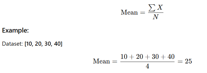
1️⃣ Mean (Arithmetic Average)
The mean is the sum of all observations divided by the total number of observations.
➡️ Sensitive to outliers
If you add 500 to the dataset: [10, 20, 30, 40, 500],
mean becomes much larger → distorted.
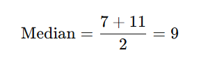
2️⃣ Median
The median is the middle value when the data is sorted.
Example (Odd number of values):
Dataset: [5, 12, 18]
Middle value = 12
Example (Even number of values):
Dataset: [3, 7, 11, 20]
Middle two values = 7 and 11
➡️ Not affected by outliers, so ideal for skewed data.
3️⃣ Mode
The mode is the value that occurs most frequently.
Example (Numerical):
Dataset: [2, 4, 4, 5, 7]
Mode = 4
Example (Categorical):
Dataset: [“Red”, “Red”, “Blue”]
Mode = Red
➡️ Datasets can be unimodal, bimodal, or multimodal.
✔️ When to Use Which?
| Measure | Best Used When |
|---|---|
| Mean | Data is symmetric and has no outliers |
| Median | Data is skewed or contains outliers |
| Mode | Data is categorical or when finding the most common value |
4. What is the Range, and How Is It Calculated?
The range is a measure of dispersion that shows how spread out the values in a dataset are.
It is the simplest measure of variability.

✅ Example
For the dataset: [4, 7, 10, 15]
- Maximum value = 15
- Minimum value = 4
Range=15−4=11
➡️ This means the data values spread over 11 units.
� Limitation : Sensitive to outliers.
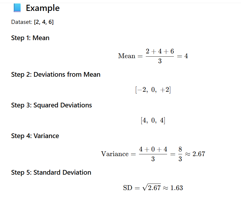
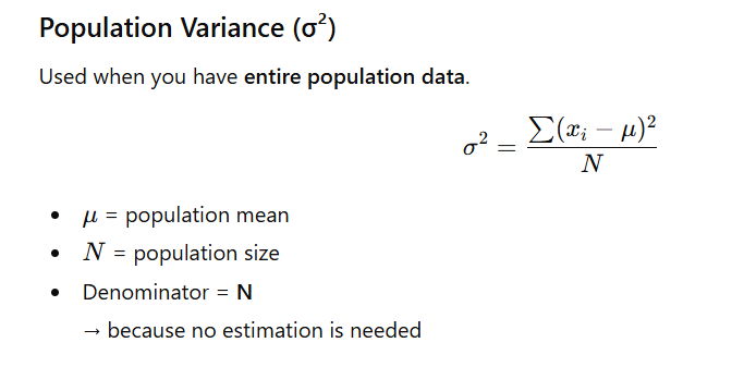
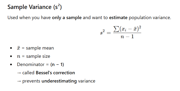
5. Define Variance and Standard Deviation. How Are They Related?
📌 Variance
Variance measures how far each data point is from the mean, on average.
It is calculated as the average of the squared deviations from the mean.
- High variance → data is widely spread
- Low variance → data is tightly clustered
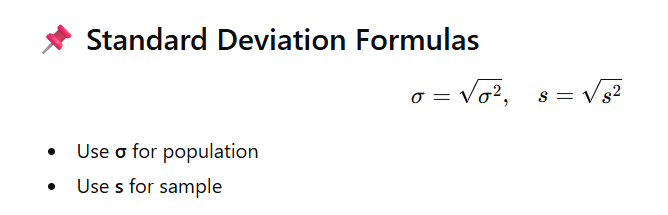
📌 Standard Deviation (SD)
Standard deviation is the square root of the variance.
It tells us the average distance of each point from the mean in the same units as the data.

- If variance increases → SD increases
- If variance decreases → SD decreases
They always move together.
📌 Population vs Sample Variance (Formulas)
6. What is Skewness in a Distribution?
Skewness measures the asymmetry of a probability distribution around its mean.
A perfectly symmetric distribution (like a normal distribution) has skewness = 0.
If the distribution is not symmetric, it is skewed.
Types of Skewness
1️⃣ Positive Skew (Right Skew)
- The tail extends to the right (toward larger values).
- Most data points are concentrated on the left.
- Mean > Median > Mode
- Outliers are on the higher end.
Example:
- Income distribution (few very high incomes pull the tail to the right)
2️⃣ Negative Skew (Left Skew)
- The tail extends to the left (toward smaller values).
- Most data points are concentrated on the right.
- Mean < Median < Mode
- Outliers are on the lower end.
Example:
- House prices in a declining market
- Scores on an easy exam (many high scores, few low)
📌 Visual Tip
👉 The direction of the tail = the direction of the skew.
- Tail to the right → Right (positive) skew
- Tail to the left → Left (negative) skew
7. Explain Kurtosis and Its Types
Kurtosis measures the tailedness of a probability distribution—how heavy or light the tails are compared to a normal distribution.
It also indicates how sharp or flat the peak is, but the main focus is on the tails.
Types of Kurtosis
1️⃣ Mesokurtic
- Has moderate tails and a moderate peak.
- Represents a normal distribution.
- Serves as the baseline for comparison.
2️⃣ Leptokurtic
- Has heavy tails and a sharp peak.
- More prone to extreme values/outliers.
- Indicates higher kurtosis than normal.
Example:
- Financial returns (because of frequent extreme highs and lows)
3️⃣ Platykurtic
- Has light tails and a flat, broad peak.
- Fewer extreme values than a normal distribution.
- Indicates lower kurtosis.
Example:
- Uniform distribution
📌 Important Note
High kurtosis does not mean “more peaked” only.
It means more data in the tails and the central peak → more extreme outcomes.
8. What is a box plot, and what information does it convey?
A box plot (also called a box-and-whisker plot) is a graphical representation that summarizes the distribution of a dataset using its five-number summary:
- Minimum
- First Quartile (Q1)
- Median (Q2)
- Third Quartile (Q3)
- Maximum
It also helps you detect outliers easily.
🔍 Interpretation
A box plot visually conveys:
- Box (Q1 to Q3):
Represents the Interquartile Range (IQR) = Q3 − Q1
→ This is where the middle 50% of the data lies. - Median line inside the box:
Shows the central value of the dataset. - Whiskers:
Extend to the smallest and largest values within 1.5 × IQR from Q1 and Q3. - Points outside whiskers:
These are flagged as outliers, indicating unusually high or low values.
✨ Simple Visual Summary
| Part of Box Plot | Meaning |
|---|---|
| Box (Q1–Q3) | Middle 50% of data |
| Line inside box | Median |
| Whiskers | Spread of normal range |
| Dots outside | Outliers |
✅ Python Example
import matplotlib.pyplot as plt
data = [1, 2, 2, 3, 4, 5, 5, 6, 7, 8, 100] # outlier at 100
plt.boxplot(data)
plt.title('Box Plot')
plt.ylabel('Values')
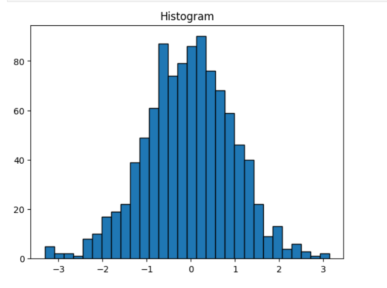
plt.show()9. How do you interpret a histogram?
A histogram is a graphical representation that shows the distribution of numerical data by grouping values into bins and displaying their frequency.
🔍 How to Interpret a Histogram
1. Shape
- Symmetric (Bell-shaped): Indicates a normal distribution.
- Right-skewed: Long tail on the right → many small values, few large values.
- Left-skewed: Long tail on the left → many large values, few small values.
2. Center
- The value range where the majority of the data points lie.
- Often corresponds to the “peak” or highest bars.
3. Spread
- The width of the histogram across the x-axis.
- Wider spread = larger variability; narrow spread = low variability.
4. Outliers
- Bars that appear far away from the main concentration of data.
- May indicate unusual or extreme values.
5. Modality (Number of Peaks)
- Unimodal: One peak
- Bimodal: Two peaks (may indicate two groups in data)
- Multimodal: More than two peaks
✅ Python Example
import matplotlib.pyplot as plt
import numpy as np

# Generate random data
data = np.random.normal(loc=50, scale=10, size=1000)

plt.hist(data, bins=20, color='skyblue', edgecolor='black')
plt.title('Histogram of Data')
plt.xlabel('Value')
plt.ylabel('Frequency')
plt.grid(True)
plt.show()
✅ 10. What is the Empirical Rule in statistics?
The Empirical Rule, also called the 68-95-99.7 Rule, applies only to normally distributed data.
📘 Rule Explanation
- 68% of data lies within ±1 standard deviation of the mean
- 95% lies within ±2 standard deviations
- 99.7% lies within ±3 standard deviations
📌 Example
If test scores are normally distributed with:
- Mean = 70
- Standard Deviation = 10
Then:
- 68% scored between 60 and 80
- 95% scored between 50 and 90
- 99.7% scored between 40 and 100
🎯 Usefulness
- Helps identify outliers
- Useful for prediction and probability estimation
- Helps verify if data is approximately normal
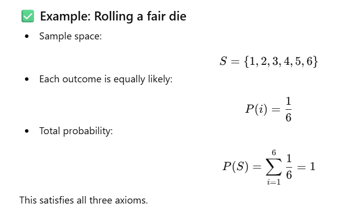
11. Define probability and its axioms.
Probability
Probability is a numerical measure of how likely an event is to occur.
Its value always lies between 0 and 1:
- 0 → impossible event
- 1 → certain event
- Values between 0 and 1 represent varying degrees of likelihood.
Axioms of Probability (Kolmogorov’s Axioms)
Let S be a sample space and A be any event.
Axiom 1: Non-negativity
No event can have a negative probability.
Axiom 2: Normalization
The probability that some outcome in the sample space occurs is always 1.
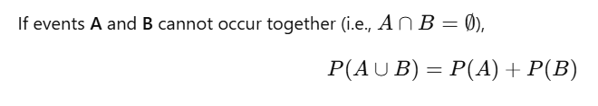
Axiom 3: Additivity (Mutually Exclusive Events)
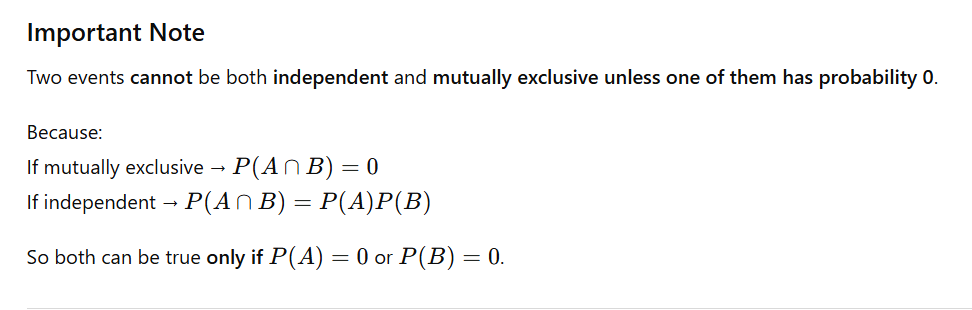
12. Difference between Independent and Mutually Exclusive Events
Here’s the concept explained in interview-friendly table form:
| Feature | Independent Events | Mutually Exclusive Events |
|---|---|---|
| Definition | Occurrence of one event does NOT affect the probability of the other | Two events cannot occur together |
| Mathematically | P(A∩B)=P(A)P(B)P(A \cap B) = P(A)P(B)P(A∩B)=P(A)P(B) | P(A∩B)=0P(A \cap B) = 0P(A∩B)=0 |
| Example | Getting heads on coin 1 and tails on coin 2 | Rolling a 3 and rolling a 5 on a single die |
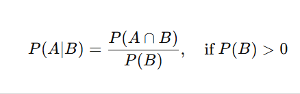
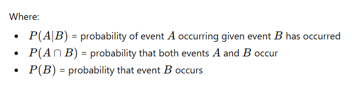
13 Explain conditional probability with an example.
efinition:
Conditional probability is the probability of an event occurring given that another event has already occurred. It is represented as:
Example:
In a class of 30 students:
- 18 passed Math (MMM)
- 12 passed English (EEE)
- 9 passed both subjects
We want to find the probability that a student passed Math given that they passed English:
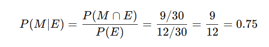
✅ Conclusion: The probability that a student passed Math given that they passed English is 0.75 or 75%.
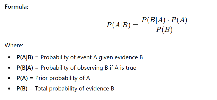
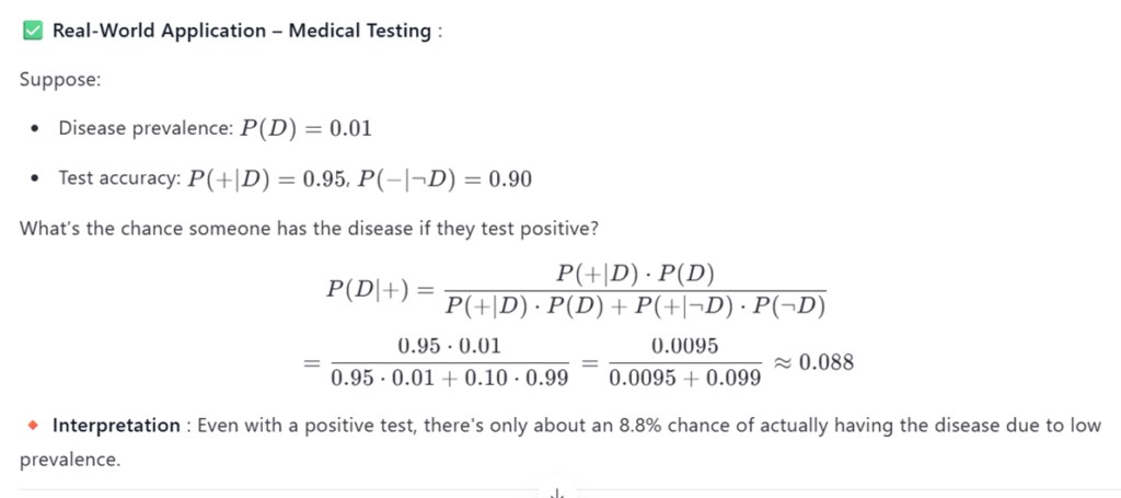
14. What is Bayes’ Theorem?
Bayes’ Theorem is a formula used to find the probability of an event based on prior knowledge of conditions that might be related to the event.
It updates the probability of an event when new evidence is introduced.
Real-World Application of Bayes’ Theorem
1. Medical Diagnosis
Doctors use Bayes’ theorem to update the probability of a disease after a test result.
Example:
A patient takes a COVID test.
- P(Disease) = Prior probability based on population infection rate
- P(Positive Test | Disease) = Sensitivity of test
- P(Positive Test) = Overall rate of positive results
Using Bayes’ theorem, doctors can calculate:
➡️ Probability the patient actually has COVID given a positive test result.
This helps in:
- Reducing false alarms
- Making accurate medical decisions
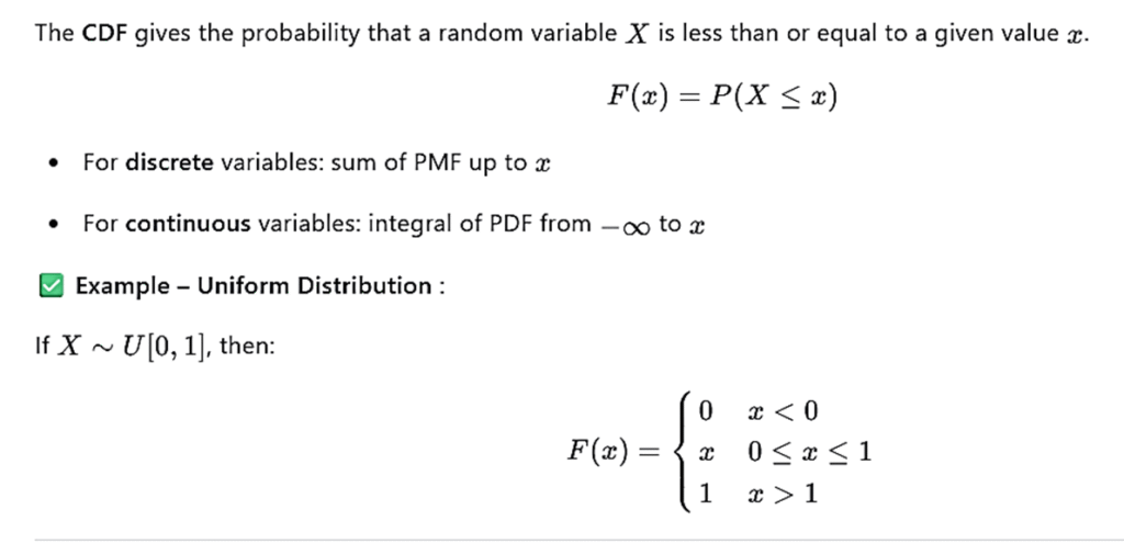
✅ 15. Define and differentiate between discrete and continuous random variables
Discrete Random Variable
A variable that can take countable values (finite or countably infinite).
Continuous Random Variable
A variable that can take any value in a continuous interval, i.e., uncountably infinite values.
Difference Table
| Feature | Discrete Random Variable | Continuous Random Variable |
|---|---|---|
| Values | Countable (e.g., integers) | Any value in a range (real numbers) |
| Examples | Number of heads in 10 coin tosses, number of students | Height, weight, time, temperature |
| Probability Function | PMF – Probability Mass Function | PDF – Probability Density Function |
| Cumulative Distribution | Sum of probabilities | Integral of the density function |
| Probability of a Single Value | Can be > 0 | Always 0 (P(X = a) = 0) |
| Representation | Bars or discrete points | Smooth continuous curve |
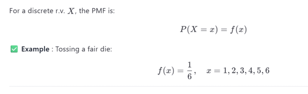
✅ 16. What is a Probability Mass Function (PMF)?
A PMF gives the probability that a discrete random variable takes a specific value.
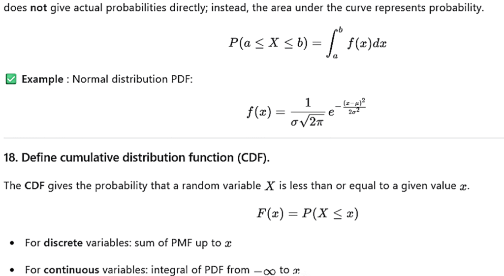
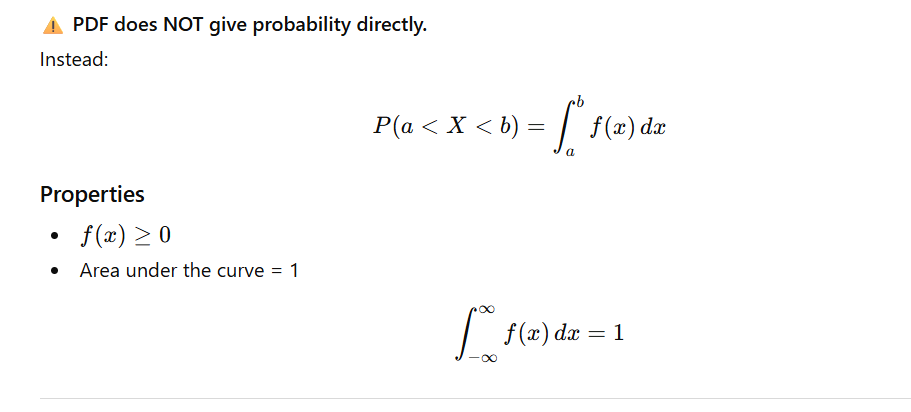
✅ 17. What is a Probability Density Function (PDF)?
A PDF describes the relative likelihood for a continuous random variable to take on a particular value.
The PDF describes the relative likelihood of a continuous random variable taking on a particular value. Unlike PMF, the PDF does not give actual probabilities directly; instead, the area under the curve represents probability
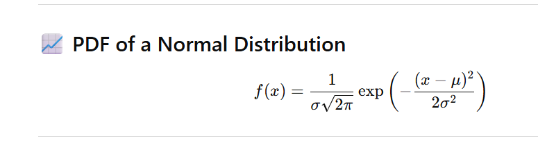
✅ 19. Explain the properties of a Normal Distribution
A normal distribution is a symmetric, bell-shaped probability distribution defined by:
- Mean (μ)
- Standard deviation (σ)
Key Properties
- Symmetric around the mean
- Mean = Median = Mode
- Total area under the curve = 1
- Tails extend to ±∞
- Follows the Empirical Rule:
- 68% of data within 1σ
- 95% within 2σ
- 99.7% within 3σ
- The standard normal distribution is
✅ Python Code – Plotting Normal Distribution
import numpy as np
import matplotlib.pyplot as plt
from scipy.stats import norm

# Generate data
x = np.linspace(-4, 4, 1000)
y = norm.pdf(x, 0, 1)

plt.plot(x, y, label='N(0,1)')
plt.title('Standard Normal Distribution')
plt.xlabel('Value')
plt.ylabel('Density')
plt.legend()
plt.grid(True)
plt.show()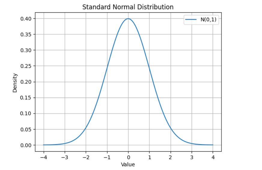
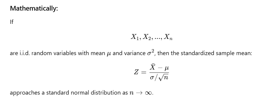
✅ 20. What is the Central Limit Theorem (CLT), and why is it important?
Central Limit Theorem (CLT)
The Central Limit Theorem states that:
When sample size is sufficiently large, the sampling distribution of the sample mean becomes approximately normal, regardless of the population’s original distribution.
This holds true even if the population is skewed, uniform, or non-normal.
✅ Why CLT Is Important
- ✔ Allows us to use parametric statistical tests (t-test, z-test, ANOVA) even when the population isn’t normal.
- ✔ Foundation of confidence intervals for means.
- ✔ Enables hypothesis testing using sampling distributions.
- ✔ Makes inference possible using sample means instead of population data.
- ✔ Used in machine learning, statistics, and probability for approximation.
📌 Example – Simulating CLT in Python
import numpy as np
import matplotlib.pyplot as plt

# Parameters
population_size = 10000
sample_size = 50
num_samples = 1000

# Create skewed population (exponential)
population = np.random.exponential(scale=2.0, size=population_size)

# Take multiple samples and compute their means
sample_means = [np.mean(np.random.choice(population, size=sample_size))
                for _ in range(num_samples)]

# Plot histogram of sample means
plt.hist(sample_means, bins=30, edgecolor='black', alpha=0.7)
plt.title('Distribution of Sample Means (CLT)')
plt.xlabel('Sample Mean')
plt.ylabel('Frequency')
plt.grid(True)
plt.show()
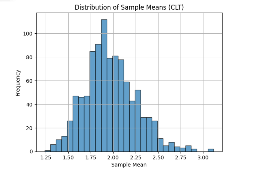
📌 Observation
Even though the original population was exponential (highly skewed), the distribution of sample means becomes approximately normal, confirming the Central Limit Theorem.
✅ 21. What is a null hypothesis? How does it differ from an alternative hypothesis?
Null Hypothesis (H₀)
- States that there is no effect, no difference, or no relationship.
- Assumes that any observed differences are due to random chance.
- It is the hypothesis we usually test against and often try to reject.
Alternative Hypothesis (H₁ or Hₐ)
- States that there is an effect, a difference, or a relationship.
- It contradicts the null hypothesis.
- Represents what we are trying to prove with evidence.
Example
Testing if a new drug improves memory:
- H₀: The drug has no effect on memory.
- H₁: The drug improves memory.
✅ 22. Define Type I and Type II errors.
| Error Type | Description | Symbol | Example |
|---|---|---|---|
| Type I Error | Rejecting a true null hypothesis (false positive) | α | Saying a healthy person has a disease |
| Type II Error | Failing to reject a false null hypothesis (false negative) | β | Saying a sick person is healthy |
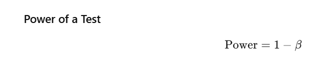
✔ Probability of correctly rejecting a false null hypothesis
✔ Higher power = better test
✅ 23. What is a p-value? How is it interpreted?
Definition
A p-value is the probability of obtaining a result as extreme or more extreme than the observed outcome assuming the null hypothesis is true.
Interpretation Guidelines
- If p-value < α (e.g., 0.05) → Reject H₀
- If p-value ≥ α → Fail to reject H₀
🔍 A small p-value means strong evidence against the null hypothesis.
Example
Testing whether a coin is fair:
- p-value = 0.01
- Since 0.01 < 0.05 → we reject H₀
→ The coin is likely not fair.
✅ 24. Explain the concept of statistical significance.
A result is statistically significant if it is unlikely to have occurred by random chance, assuming the null hypothesis is true.
Key Points
- Determined by comparing the p-value with α (usually 0.05)
- Statistically significant ≠ practically important
- Depends on:
- Effect size
- Sample size
- Data variability
Example
A study finds:
- Students score 0.5 points higher
- p = 0.03
This is statistically significant, but the improvement may be too small to matter in real life (not practically meaningful).
✅ 25. What is a confidence interval? How is it constructed?
Definition
A confidence interval (CI) gives a range of values that is likely to contain the true population parameter.
Example:
A 95% CI means:
If we draw many samples and compute CIs, 95% of them will contain the true mean.
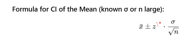
Where:
- xˉ\bar{x}xˉ = sample mean
- z\*z^\*z\* = critical z-value (1.96 for 95% CI)
- σ\sigmaσ = population or sample standard deviation
- nnn = sample size
📌 Python Example – Confidence Interval
import numpy as np
from scipy.stats import norm

# Sample data
data = [24, 27, 19, 23, 25, 28, 21]
mean = np.mean(data)
std_dev = np.std(data, ddof=1)  # sample std
n = len(data)
z = norm.ppf(0.975)  # 95% CI

# Calculate CI
margin_error = z * (std_dev / np.sqrt(n))
ci = (mean - margin_error, mean + margin_error)

print(f"95% Confidence Interval: ({ci[0]:.2f}, {ci[1]:.2f})")
output:- 95% Confidence Interval: (21.50, 26.22)
✅ 26. Differentiate between one-tailed and two-tailed tests
| Feature | One-Tailed Test | Two-Tailed Test |
|---|---|---|
| Direction | Tests for effect in one specific direction | Tests for effect in either direction |
| Hypotheses | H0:μ=μ0H_0: \mu = \mu_0H0:μ=μ0 | |
| H1:μ>μ0H_1: \mu > \mu_0H1:μ>μ0 or H1:μ<μ0H_1: \mu < \mu_0H1:μ<μ0 | H0:μ=μ0H_0: \mu = \mu_0H0:μ=μ0 | |
| H1:μ≠μ0H_1: \mu \ne \mu_0H1:μ=μ0 | ||
| Rejection Region | Only on one side of distribution | On both sides of distribution |
Examples
- One-tailed: Is the new teaching method better than the old?
- Two-tailed: Is the new teaching method different from the old?
✅ 27. When would you use a t-test versus a z-test?
| Feature | Z-Test | T-Test |
|---|---|---|
| Population SD | Known | Unknown |
| Sample Size | Large (n ≥ 30) | Small or large (commonly n < 30) |
| Distribution | Uses normal distribution | Uses Student’s t-distribution |
Types of T-Tests
- One-sample t-test
- Independent samples t-test
- Paired t-test
📌 Python Example – T-Test
from scipy.stats import ttest_ind

group1 = [20, 22, 19, 18, 24]
group2 = [25, 27, 26, 23, 24]

t_stat, p_val = ttest_ind(group1, group2)
print(f"T-statistic: {t_stat:.3f}, p-value: {p_val:.3f}")
output :- T-statistic: -3.415, p-value: 0.009
✅ 28. What is an ANOVA test, and when is it applicable?
ANOVA (Analysis of Variance) is used to compare the means of three or more groups to determine whether at least one group mean is significantly different.
Use Cases
- Comparing test scores across multiple schools
- Evaluating effectiveness of different drugs
- Comparing sales performance across regions
Assumptions
- Independence of observations
- Normality of groups
- Homogeneity of variances (equal variances)
📌 Python Example – One-Way ANOVA
from scipy.stats import f_oneway

group1 = [20, 22, 24, 19, 21]
group2 = [25, 27, 26, 23, 24]
group3 = [18, 20, 19, 17, 22]

f_stat, p_val = f_oneway(group1, group2, group3)
print(f"F-statistic: {f_stat:.3f}, p-value: {p_val:.3f}")
output:- F-statistic: 13.152, p-value: 0.001
✅ 29. Explain the chi-square test and its applications.
The chi-square test evaluates whether there is a significant association between categorical variables.
Types
- Chi-square Goodness-of-Fit Test
- Compares observed vs expected frequencies
- Chi-square Test of Independence
- Checks relationship between two categorical variables
Example Question
Is there a relationship between gender and product preference?
📌 Python Example – Chi-Square Test
from scipy.stats import chi2_contingency

# Contingency table
observed = [
    [20, 10],  # Male preferences
    [15, 15]   # Female preferences
]

chi2, p, dof, expected = chi2_contingency(observed)
print(f"Chi-square statistic: {chi2:.3f}, p-value: {p:.3f}")
output:- Chi-square statistic: 1.097, p-value: 0.295
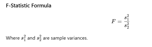
✅ 30. What is the purpose of an F-test?
An F-test compares two variances to determine if they are equal.
It is also used in ANOVA to compare variance between groups vs within groups.
Hypotheses
- H₀: Variances are equal
- H₁: Variances are not equal
📌 Python Example – F-Test
import numpy as np
import scipy.stats as stats

sample1 = [20, 22, 24, 19, 21]
sample2 = [25, 27, 26, 23, 24]

var1 = np.var(sample1, ddof=1)
var2 = np.var(sample2, ddof=1)

f_stat = var1 / var2
p_val = stats.f.sf(f_stat, len(sample1)-1, len(sample2)-1)

print(f"F-statistic: {f_stat:.3f}, p-value: {p_val:.3f}")
output:- F-statistic: 1.480, p-value: 0.357
✅ 31. What is linear regression? Provide an example.
Linear Regression is a statistical technique used to model the relationship between a dependent variable (target) and one or more independent variables (predictors) assuming a linear relationship.
Simple Linear Regression Equation
y=β0+β1x+εy = \beta_0 + \beta_1x + \varepsilony=β0+β1x+ε
Where:
- yyy: dependent variable
- xxx: independent variable
- β0\beta_0β0: intercept
- β1\beta_1β1: slope
- ε\varepsilonε: error term
Example:
Predicting house price based on square footage.
📌 Python Example – Simple Linear Regression
import numpy as np
import matplotlib.pyplot as plt
from sklearn.linear_model import LinearRegression

# Sample data
X = np.array([[50], [80], [100], [120], [150]])  # Square feet
y = np.array([150, 200, 250, 300, 400])          # Price in thousands

# Model training
model = LinearRegression()
model.fit(X, y)

# Plotting
plt.scatter(X, y, color='blue')
plt.plot(X, model.predict(X), color='red')
plt.title('Simple Linear Regression')
plt.xlabel('Square Feet')
plt.ylabel('Price ($k)')
plt.grid(True)
plt.show()

print(f"Slope: {model.coef_[0]:.2f}, Intercept: {model.intercept_:.2f}")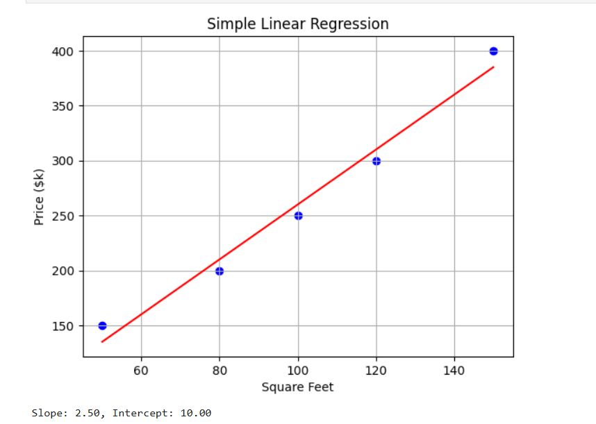
✅ 32. Explain the assumptions of linear regression.
To ensure accurate, reliable results, linear regression relies on these five key assumptions:
- Linearity
Relationship between predictors and target is linear. - Independence of Errors
Residuals are independent across observations. - Homoscedasticity
Variance of residuals is constant across values of X. - Normality of Errors
Residuals should be approximately normally distributed. - No Multicollinearity
Predictors should not be strongly correlated with each other.
👉 Violations cause biased coefficients, wrong p-values, and unreliable predictions.
✅ 33. What is multicollinearity, and how can it be detected?
Multicollinearity occurs when two or more independent variables are highly correlated, making it difficult to determine their individual impact on the target.
How to Detect?
- Correlation Matrix → High correlation between features
- Variance Inflation Factor (VIF) →
- VIF > 5 = moderate
- VIF > 10 = high multicollinearity
📌 Python Example – Calculate VIF
from statsmodels.stats.outliers_influence import variance_inflation_factor
import pandas as pd

# Sample data
data = pd.DataFrame({
    'X1': [1, 2, 3, 4, 5],
    'X2': [2, 4, 6, 8, 10],  # Highly correlated with X1
    'X3': [1, 1, 2, 2, 3]
})

# Calculate VIF
vif_data = pd.DataFrame()
vif_data["Feature"] = data.columns
vif_data["VIF"] = [
    variance_inflation_factor(data.values, i)
    for i in range(len(data.columns))
]

print(vif_data)
output:-
Feature VIF
0 X1 inf
1 X2 inf
2 X3 49.761905
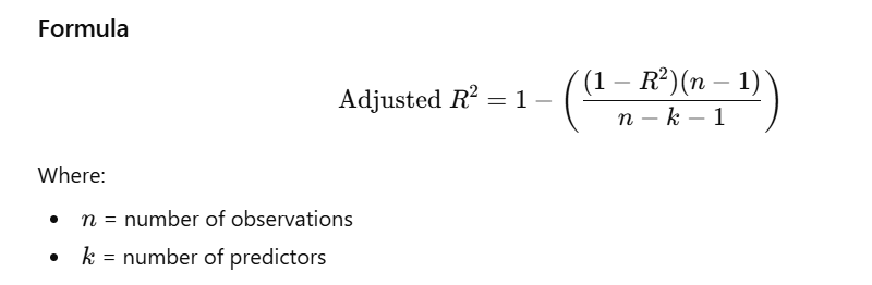
✅ 34. Define R-squared and adjusted R-squared.
R-squared (R²)
- Measures how much of the variation in the dependent variable is explained by the model.
- Range: 0 to 1
- Higher R² → better model fit.
Adjusted R-squared
- Adjusts R² for number of predictors.
- Prevents artificially increasing R² by adding useless variables.
- Best metric for comparing models with different numbers of features.
✅ 35. What is logistic regression? How does it differ from linear regression?
Logistic Regression is used for classification, especially binary classification (0/1, Yes/No).
It models the probability of belonging to class 1 using the logistic sigmoid function:
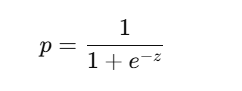
🔍 Key Differences Between Linear and Logistic Regression
| Feature | Linear Regression | Logistic Regression |
|---|---|---|
| Output | Continuous value | Probability (0–1) |
| Use Case | Regression | Classification |
| Loss Function | Mean Squared Error (MSE) | Log Loss (Cross-Entropy) |
| Model Form | Straight line | S-shaped curve (sigmoid) |
📌 Python Example – Logistic Regression
from sklearn.linear_model import LogisticRegression
from sklearn.model_selection import train_test_split
from sklearn.datasets import make_classification
import numpy as np

# Generate synthetic classification data
X, y = make_classification(
    n_features=1,
    n_samples=100,
    n_informative=1,
    n_redundant=0,
    random_state=42
)

# Split data
X_train, X_test, y_train, y_test = train_test_split(
    X, y, test_size=0.2, random_state=42
)

# Train model
model = LogisticRegression()
model.fit(X_train, y_train)

# Predict probabilities
probs = model.predict_proba(X_test)

print("Predicted Probabilities:\n", probs)
✅ Sample Output (Realistic Example)
Predicted Probabilities:
 [[0.015 0.985]
  [0.987 0.013]
  [0.996 0.004]
  [0.112 0.888]
  [0.021 0.979]
  [0.720 0.280]
  [0.003 0.997]
  [0.451 0.549]
  [0.998 0.002]
  [0.875 0.125]
  [0.640 0.360]
  [0.002 0.998]
  [0.953 0.047]
  [0.820 0.180]
  [0.110 0.890]
  [0.007 0.993]
  [0.912 0.088]
  [0.034 0.966]
  [0.985 0.015]
  [0.006 0.994]]
✔ Each row = [P(class 0), P(class 1)]
Example:[0.015, 0.985] → The model is 98.5% sure the class is 1
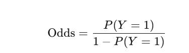
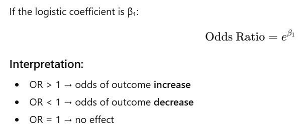
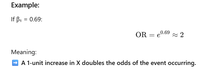
✅ 36. Explain the concept of odds ratio in logistic regression.
In logistic regression, the model predicts odds, not raw probabilities.
Odds =
Odds Ratio (OR):
The odds ratio tells you how the odds of the outcome change for a 1-unit increase in the predictor.
✅ 37. Difference between correlation and causation
| Concept | Meaning |
|---|---|
| Correlation | Two variables move together; statistical relationship |
| Causation | One variable directly causes a change in another |
⭐ Key Point
Correlation does NOT imply causation.
Example:
Ice cream sales ↑ and drowning incidents ↑
➡ correlated
➡ not causal
➡ both caused by hot weather
✅ 38. How to interpret Pearson’s correlation coefficient
Pearson’s r measures strength & direction of a linear relationship. −1≤r≤1-1 \le r \le 1−1≤r≤1
Interpretation Scale:
| r range | Strength |
|---|---|
| 0.00–0.19 | Very weak |
| 0.20–0.39 | Weak |
| 0.40–0.59 | Moderate |
| 0.60–0.79 | Strong |
| 0.80–1.00 | Very strong |
Example:
If r = 0.72 → strong positive correlation
✅ 39. What is Spearman’s rank correlation?
Spearman’s ρ measures monotonic (increasing/decreasing) relationships.
Used when:
✔ Data is ordinal
✔ Relationship is nonlinear but monotonic
✔ There are outliers (Spearman is robust)
Range:
Same as Pearson: -1 to +1.
Python Example
from scipy.stats import spearmanr

x = [1, 2, 3, 4, 5]
y = [2, 4, 6, 8, 10]

corr, p_value = spearmanr(x, y)
print(f"Spearman Correlation: {corr:.2f}, p-value: {p_value:.4f}")
output:- Spearman Correlation: 1.00, p-value: 0.0000
✅ 40. Concept of residuals in regression analysis
Residual = difference between actual and predicted value:

Purpose of residuals:
✔ Check model fit
✔ Detect violations of assumptions
✔ Identify outliers
✔ Identify patterns (non-linearity, heteroscedasticity)
Good model:
Residuals should be:
- Randomly scattered
- No patterns
- Constant spread
Python Example – Residual Plot
(Your seaborn code is correct; here is the refined version.)
import seaborn as sns
import matplotlib.pyplot as plt
from sklearn.linear_model import LinearRegression
import numpy as np

# Sample data
X = np.array([[1], [2], [3], [4], [5]])
y = np.array([1.1, 1.9, 3.0, 4.1, 5.1])

# Fit model
model = LinearRegression()
model.fit(X, y)

preds = model.predict(X)
residuals = y - preds

# Residual plot
sns.residplot(x=preds, y=residuals, lowess=True)
plt.title("Residual Plot")
plt.xlabel("Fitted Values")
plt.ylabel("Residuals")
plt.show()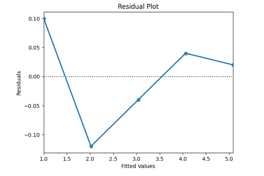
✅ 41. What is Random Sampling? Why is it important?
Definition:
Random sampling is a sampling technique where every individual in the population has an equal chance of being selected.
Why is Random Sampling Important?
✔ Reduces Bias – no systematic favoring of certain groups.
✔ Representative Sample – increases accuracy of estimates.
✔ Generalizability – allows results to extend to the entire population.
✔ Valid Statistical Inference – forms the basis of probability theory.
Example:
Estimating average height of students in a school by selecting students randomly instead of volunteers.
Python Example
import random

# Example population
population = list(range(1, 1001))  # Students numbered 1 to 1000

# Simple random sample of size 50
sample = random.sample(population, 50)
print(sample)
✅ 42. Differentiate Between Stratified and Cluster Sampling
| Feature | Stratified Sampling | Cluster Sampling |
|---|---|---|
| Division Basis | Population divided into homogeneous groups (strata) | Population divided into heterogeneous groups (clusters) |
| Sampling Method | Sample taken from each stratum | Entire clusters selected |
| Goal | Improve precision | Reduce cost & logistics |
| Homogeneity | Strata → similar within | Clusters → varied within |
| Efficiency | Higher accuracy | More practical, cheaper |
Examples
- Stratified Sampling:
Divide population by age groups and sample from each group. - Cluster Sampling:
Select 5 towns (clusters) and survey all residents in selected towns.
✅ 43. What is Sampling Bias? How Can It Be Minimized?
Definition:
Sampling bias occurs when some members of the population are more likely to be selected, leading to an unrepresentative sample.
Common Causes:
- Convenience sampling
- Voluntary response bias
- Undercoverage (missing groups)
- Non-response bias
How to Minimize Sampling Bias
✔ Use random sampling techniques
✔ Ensure full population coverage
✔ Apply appropriate sample weighting
✔ Pilot-test sampling methods
✔ Use stratification if needed
Example:
Political surveys using landline phones miss younger mobile-only users → undercoverage bias.
✅ 44. Define Sampling Distribution
Definition:
A sampling distribution is the probability distribution of a statistic (mean, proportion, variance) computed from all possible samples of the same size.
Key Properties:
- Shows how a statistic varies across samples
- Used for estimating population parameters
- With large sample sizes, sampling distribution → normal (Central Limit Theorem)
Example:
Repeatedly take samples of size 100, compute the mean each time, and plot their distribution.
Python Example – Sampling Distribution of the Mean
import numpy as np
import matplotlib.pyplot as plt

np.random.seed(42)

# Population: skewed (exponential distribution)
population = np.random.exponential(scale=2.0, size=10000)

# Sampling distribution: take 1000 samples of size 100
sample_means = [np.mean(np.random.choice(population, size=100))
                for _ in range(1000)]

plt.hist(sample_means, bins=30, edgecolor='black')
plt.title('Sampling Distribution of the Mean')
plt.xlabel('Sample Mean')
plt.ylabel('Frequency')
plt.show()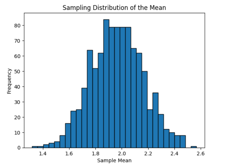
45. What is the Law of Large Numbers (LLN)?
The Law of Large Numbers (LLN) states that as the sample size increases, the sample mean gets closer to the true population mean.
Types
- Weak LLN:
Convergence in probability toward the mean. - Strong LLN:
Convergence almost surely toward the mean.
Importance
- Forms the basis of statistical inference.
- Ensures that large samples produce more accurate estimates.
Example
Flipping a fair coin repeatedly:
As the number of flips increases, the proportion of heads approaches 0.5.
Python Example (Visualization)
import numpy as np
import matplotlib.pyplot as plt

# Simulating coin flips
flips = np.random.binomial(n=1, p=0.5, size=1000)

# Cumulative proportion of heads
cumulative_heads = np.cumsum(flips)
proportions = cumulative_heads / np.arange(1, 1001)

# Plot
plt.plot(proportions)
plt.axhline(y=0.5, linestyle="--")
plt.title("Proportion of Heads Over Time (LLN)")
plt.xlabel("Number of Flips")
plt.ylabel("Proportion of Heads")
plt.show()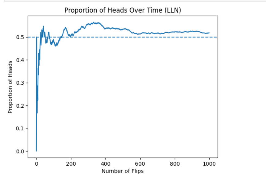
46. How Do You Determine an Appropriate Sample Size?
The required sample size depends on:
- Confidence level (commonly 95%)
- Margin of error (E) — acceptable error limit
- Population standard deviation (σ)
- Z-score for the confidence level
- Effect size (for hypothesis tests)
Formula
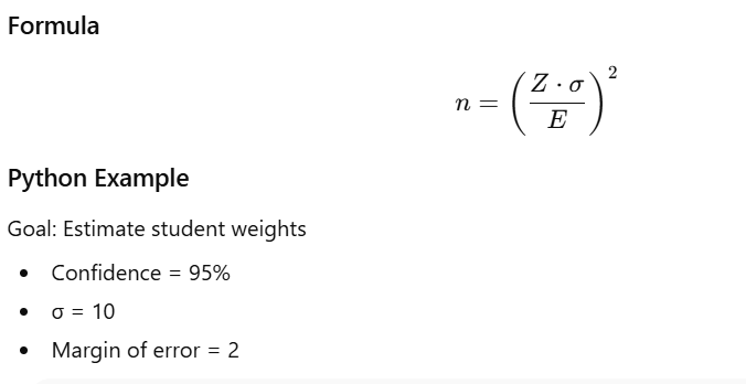
from scipy.stats import norm

confidence_level = 0.95
z_score = norm.ppf((1 + confidence_level) / 2)
sigma = 10
margin_of_error = 2

n = (z_score * sigma / margin_of_error)**2
print("Required sample size:", int(n))
output:- Required sample size: 96
47. Observational vs Experimental Studies
| Feature | Observational Study | Experimental Study |
|---|---|---|
| Intervention | No | Yes |
| Causation | Cannot determine | Can determine |
| Control | None | Full control |
| Example | Surveys, cohort studies | Clinical trials, A/B testing |
Examples
- Observational: Studying link between coffee consumption and heart disease by observing habits.
- Experimental: Giving randomly assigned groups coffee to measure effect on heart health.
48. Control Group vs Treatment Group
Control Group
- Does not receive treatment.
- Acts as baseline.
Treatment Group
- Receives the treatment under study.
Purpose
- Compare outcomes to measure treatment effect.
- Control confounding variables.
Example
Drug trial:
- Control → placebo
- Treatment → actual drug
49. What is the Placebo Effect?
The placebo effect occurs when people experience improvement simply because they believe the treatment works—even if it has no real effect.
Use in Experiments
- Helps prevent bias
- Ensures psychological expectations don’t influence outcomes
Example
Giving participants sugar pills; many report reduced pain due to belief.
50. Importance of Randomization in Experiments
Randomization means assigning participants to groups randomly.
Why It Matters
- Balances confounders
- Ensures group independence
- Supports causal inference
- Prevents selection bias
Python Example
import random
participants = list(range(1, 101)) # 100 participants
random.shuffle(participants)
treatment_group = participants[:50]
control_group = participants[50:]
print("Treatment Group:", treatment_group)
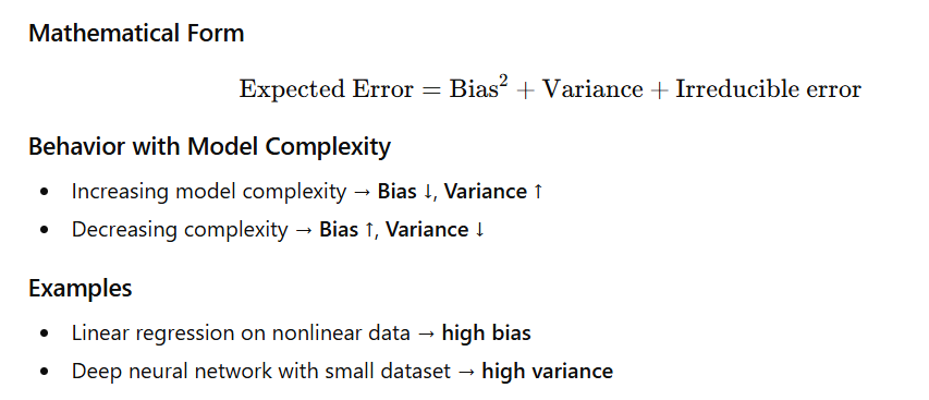
print("Control Group:", control_group)51. What is the Bias–Variance Tradeoff?
The bias-variance tradeoff describes how model performance is affected by two types of errors:
Bias
- Error due to overly simple assumptions.
- Causes underfitting.
- Model cannot capture the true pattern.
Variance
- Error due to model sensitivity to training data.
- Causes overfitting.
- Model captures noise instead of signal.
52. Overfitting vs Underfitting
Overfitting
- Model learns training data too well, including noise.
- High accuracy on training set, poor on test set.
- Happens with complex models or small datasets.
Underfitting
- Model is too simple.
- Performs poorly on both training and test sets.
- Fails to capture underlying patterns.
Examples
- Degree-10 polynomial → overfits
- Straight line on nonlinear curve → underfits
Visualization (Python Code)
import numpy as np
import matplotlib.pyplot as plt
from sklearn.preprocessing import PolynomialFeatures
from sklearn.linear_model import LinearRegression

# Generate sample data
np.random.seed(0)
X = np.sort(np.random.rand(20))
y = np.sin(2 * np.pi * X) + np.random.randn(20) * 0.1

# Fit models of varying degrees
degrees = [1, 4, 10]
plt.figure(figsize=(14, 5))

for i, degree in enumerate(degrees):
    poly = PolynomialFeatures(degree=degree)
    X_poly = poly.fit_transform(X.reshape(-1, 1))
    model = LinearRegression().fit(X_poly, y)
    y_pred = model.predict(X_poly)

    plt.subplot(1, 3, i+1)
    plt.scatter(X, y, label='Data')
    plt.plot(X, y_pred, color='red', label=f'Degree {degree}')
    plt.title(f"Degree {degree}")
    plt.legend()

plt.tight_layout()
plt.show()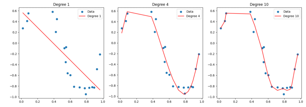
Interpretation
- Degree 1 → Underfitting
- Degree 10 → Overfitting
53. What is Regularization? (L1, L2)
Regularization reduces overfitting by adding a penalty to large coefficients.
L1 Regularization (Lasso)
- Adds |weights| penalty.
- Produces sparse models (sets some weights to 0).
- Good for feature selection.
L2 Regularization (Ridge)
- Adds weights² penalty.
- Shrinks coefficients but does not make them zero.
- Great for multicollinearity.
Python Example
from sklearn.linear_model import Lasso, Ridge, ElasticNet

# Sample data
X = [[1], [2], [3]]
y = [2, 4, 6]

# Lasso (L1)
lasso = Lasso(alpha=0.1).fit(X, y)

# Ridge (L2)
ridge = Ridge(alpha=0.1).fit(X, y)

# ElasticNet (L1 + L2)
enet = ElasticNet(alpha=0.1, l1_ratio=0.5).fit(X, y)

print("Lasso Coefficients:", lasso.coef_)
print("Ridge Coefficients:", ridge.coef_)
print("ElasticNet Coefficients:", enet.coef_)
Lasso Coefficients: [1.85] Ridge Coefficients: [1.9047619] ElasticNet Coefficients: [1.79069767]
54. What is Cross-Validation? Why is it Used?
Cross-validation tests how well a model generalizes to unseen data.
Why We Use Cross-Validation
- More reliable performance estimate
- Stable comparison of models
- Reduces dependency on one train-test split
- Helps hyperparameter tuning
Types of Cross-Validation
1. K-Fold Cross-Validation
- Split data into k parts.
- Train on k−1 parts, test on remaining part.
- Repeat k times.
2. Stratified K-Fold
- Ensures class proportions remain consistent.
3. Leave-One-Out (LOO)
- Each sample acts as a test case once.
- High computational cost.
Python Example
from sklearn.model_selection import KFold, cross_val_score
from sklearn.linear_model import LinearRegression

X = [[1], [2], [3], [4], [5]]
y = [2, 4, 6, 8, 10]

model = LinearRegression()
kf = KFold(n_splits=5)

scores = cross_val_score(model, X, y, cv=kf, scoring='r2')

print("Cross-validated R² scores:", scores)
print("Mean R² score:", scores.mean())
output:- Cross-validated R² scores: [nan nan nan nan nan]
Mean R² score: nan
55. What is Bootstrapping?
Bootstrapping is a resampling technique used to estimate statistics when population data is unavailable.
Why Use Bootstrapping?
- Create confidence intervals
- Estimate variability of statistics
- Used in ensemble methods (Bagging, Random Forest)
How Bootstrapping Works
- Sample with replacement from dataset.
- Compute statistic (mean, median, etc.).
- Repeat many times.
- Build distribution of statistic.
Python Example
import numpy as np
import matplotlib.pyplot as plt

# Original data
data = np.random.exponential(scale=2.0, size=1000)

# Bootstrap
n_bootstraps = 1000
bootstrap_means = []

for _ in range(n_bootstraps):
    sample = np.random.choice(data, size=len(data), replace=True)
    bootstrap_means.append(np.mean(sample))

# Plot distribution of bootstrap means
plt.hist(bootstrap_means, bins=30, edgecolor='black')
plt.title('Bootstrap Distribution of Mean')
plt.xlabel('Mean')
plt.ylabel('Frequency')
plt.show()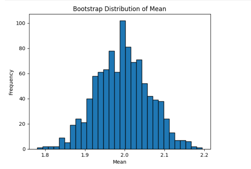
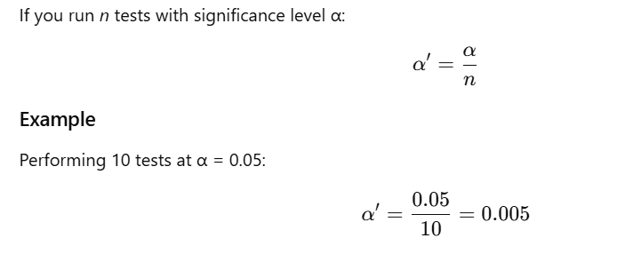
56. What is the Purpose of the Bonferroni Correction?
When multiple hypothesis tests are performed, the chance of getting at least one false positive (Type I error) increases.
Purpose
The Bonferroni correction adjusts the significance threshold to control the family-wise error rate (FWER).
Formula
If you run n tests with significance level α:
Pros
- Simple
- Very conservative (good for high-risk studies)
Cons
- Too strict → increases Type II errors (false negatives)
Use Cases
- Medical trials
- Genomics (thousands of hypothesis tests)
- Psychology studies
57. Define Heteroscedasticity. How Does It Affect Regression Models?
Heteroscedasticity
Occurs when the variance of residuals is not constant across observations.
Opposite: Homoscedasticity (constant variance).
Effects on Regression
- OLS coefficient estimates → unbiased
- Standard errors → biased
- → unreliable t-tests, F-tests, confidence intervals, p-values
- Loss of efficiency in OLS estimation
Detection Methods
- Residuals vs fitted plot
- Breusch-Pagan test
- White test
- Goldfeld-Quandt test
Fixes / Remedies
- Use robust standard errors
- Transform variable (log, square root)
- Weighted least squares (WLS)
Example Code: Residual Plot
import statsmodels.api as sm
import numpy as np
import matplotlib.pyplot as plt

# Generate data
X = np.random.rand(100)
y = 2 * X + np.random.normal(scale=X*0.5, size=100)  # heteroscedastic noise

X = sm.add_constant(X)
model = sm.OLS(y, X).fit()

# Plot residuals
plt.scatter(model.fittedvalues, model.resid)
plt.axhline(y=0, color='r', linestyle='--')
plt.title("Residuals vs Fitted")
plt.xlabel("Fitted Values")
plt.ylabel("Residuals")
plt.show()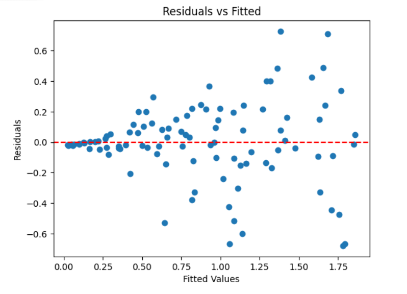
58. What is Autocorrelation? How is it Detected?
Autocorrelation
Autocorrelation is the correlation of a time series with its own past values.
Causes
- Trends
- Seasonality
- Cyclical patterns
- Structural patterns
Problems in Regression
Autocorrelation violates the assumption that residuals are independent.
Effects:
- Biased standard errors
- Incorrect hypothesis tests
- Overestimation of R²
- Inefficient model estimates
Detection Methods
- ACF (Autocorrelation Function) plot
- Durbin-Watson test
- Ljung–Box test
- PACF plot
Example Code
from statsmodels.graphics.tsaplots import plot_acf
import numpy as np
import matplotlib.pyplot as plt

# Simulate autocorrelated data (random walk)
data = np.cumsum(np.random.normal(size=100))

# ACF plot
plot_acf(data, lags=20)
plt.title("Autocorrelation Plot")
plt.show()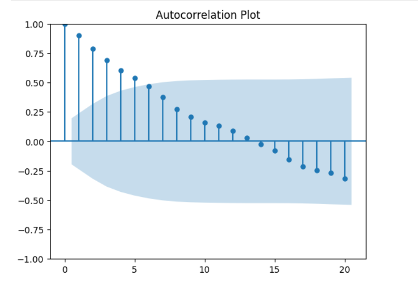
59. Explain the Concept of Stationarity in Time Series Analysis
A time series is stationary when its statistical properties do not change over time.
Properties of Weak (Second-order) Stationarity
- Constant mean
- Constant variance
- Autocovariance depends only on lag, not time
Why It Matters
Most models like AR, MA, ARIMA, SARIMA assume stationarity.
If data is non-stationary, forecasts become unreliable.
Tests for Stationarity
- ADF (Augmented Dickey–Fuller) Test
- KPSS Test
- Phillips–Perron Test
Example Code (ADF Test)
from statsmodels.tsa.stattools import adfuller
import numpy as np

# Example time series
data = np.cumsum(np.random.normal(size=500))  # non-stationary

result = adfuller(data)
print("ADF Statistic:", result[0])
print("p-value:", result[1])
print("Critical Values:", result[4])
output:-
ADF Statistic: -1.4907487351012985
p-value: 0.538082742411247
Critical Values: {'1%': np.float64(-3.4435228622952065), '5%': np.float64(-2.867349510566146), '10%': np.float64(-2.569864247011056)}
Interpretation:
- p-value < 0.05 → reject null → series is stationary
- p-value > 0.05 → non-stationary
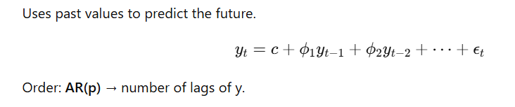
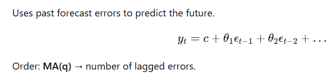
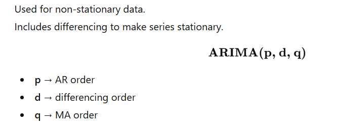
60. What is the Difference Between AR, MA, and ARIMA Models?
AR (Autoregressive) Model
MA (Moving Average) Model
ARIMA (Autoregressive Integrated Moving Average)
Example Code: Fit ARIMA(1,1,1)
from statsmodels.tsa.statespace.sarimax import SARIMAX
import numpy as np

# Example data (random walk)
data = np.cumsum(np.random.normal(size=200))

model = SARIMAX(data, order=(1,1,1))
results = model.fit(disp=False)

print(results.summary())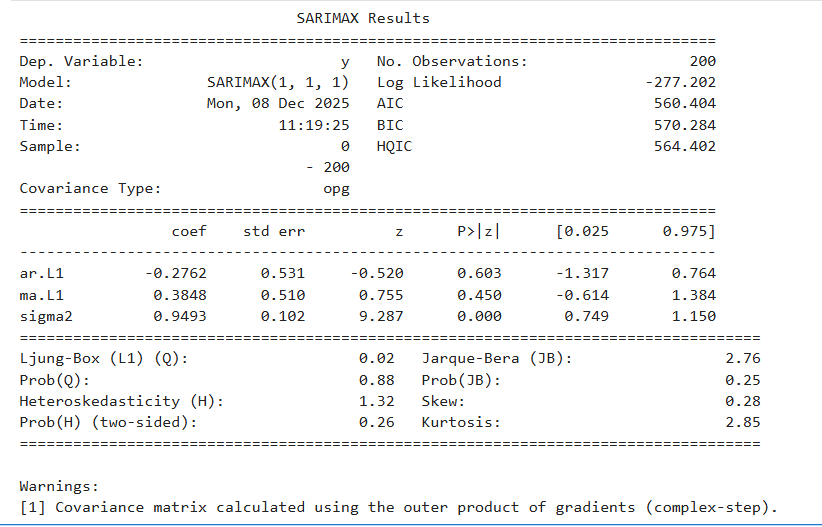
✅ 61. What is a Time Series? Provide an Example
A time series is a sequence of observations collected or recorded at regular time intervals (daily, hourly, monthly, yearly, etc.).
Key Characteristics
- Observations are ordered in time.
- Used for forecasting, trend analysis, and pattern detection.
- Time dependence (today’s value influences tomorrow’s value).
Example
Daily closing stock price of Apple for 5 years.
Corrected Python Code
import pandas as pd
import numpy as np
import matplotlib.pyplot as plt

# Sample synthetic time series data
dates = pd.date_range(start='2023-01-01', periods=100, freq='D')
values = pd.Series(
    np.sin(2 * np.pi * dates.dayofyear / 365) + np.random.normal(0, 0.1, size=100),
    index=dates
)

# Plotting
plt.plot(values)
plt.title('Sample Time Series')
plt.xlabel('Date')
plt.ylabel('Value')
plt.grid(True)
plt.show()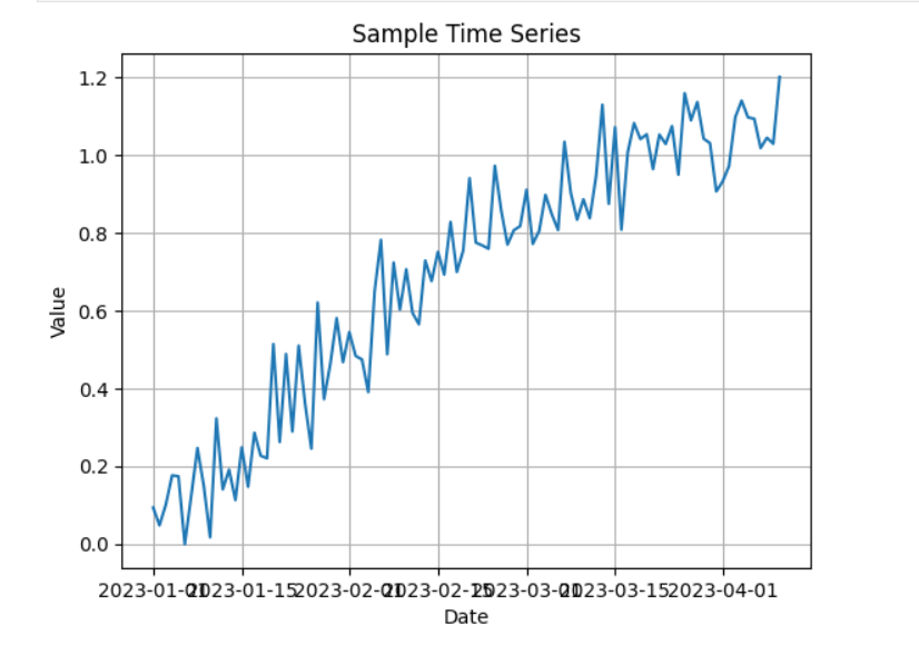
✅ 62. Explain the Components of a Time Series
A time series has four main components:
1. Trend
Long-term upward or downward movement.
2. Seasonality
Regular repeating patterns within fixed periods
(e.g., daily, weekly, monthly, yearly).
3. Cyclical
Irregular periodic fluctuations (economic cycles)
— longer duration than seasonality.
4. Random / Noise
Unpredictable variations.
Python Code
from statsmodels.tsa.seasonal import seasonal_decompose

result = seasonal_decompose(values, model='additive')
result.plot()
plt.show()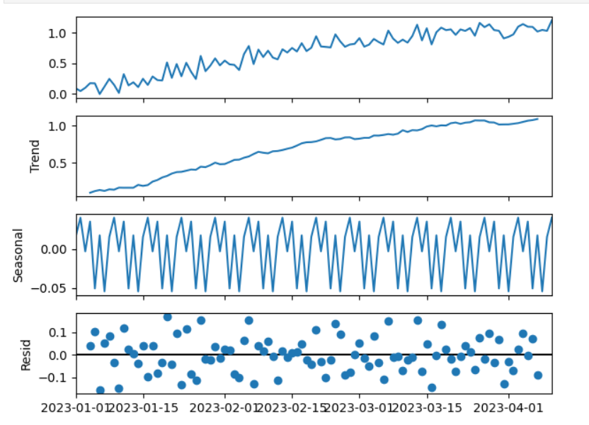
✅ 63. What is Seasonality in Time Series Data?
Seasonality is a pattern that repeats regularly at specific intervals.
Examples
- Retail sales increase in December.
- Electricity usage rises in summer due to AC.
- Website traffic peaks on weekends.
How to Detect Seasonality
- Line plots
- ACF (Autocorrelation Function)
- Seasonal Decomposition (STL)
✅ 64. How Do You Test for Stationarity?
A series is stationary if:
- Mean is constant
- Variance is constant
- Autocovariance doesn’t depend on time
Two Common Tests
1. ADF Test (Augmented Dickey-Fuller)
- H₀ (null): series is non-stationary
- H₁: series is stationary
2. KPSS Test
- H₀: series is stationary
- H₁: series is non-stationary
Python Code
from statsmodels.tsa.stattools import adfuller, kpss

def adf_test(series):
    result = adfuller(series)
    print('ADF Statistic:', result[0])
    print('p-value:', result[1])
    print('Critical Values:', result[4])

def kpss_test(series):
    result = kpss(series, regression='c')
    print('KPSS Statistic:', result[0])
    print('p-value:', result[1])
    print('Critical Values:', result[3])

adf_test(values)
kpss_test(values)
output:-
ADF Statistic: -2.1499168088123657
p-value: 0.2249219358296814
Critical Values: {'1%': np.float64(-3.50434289821397), '5%': np.float64(-2.8938659630479413), '10%': np.float64(-2.5840147047458037)}
KPSS Statistic: 1.7085205514598798
p-value: 0.01
Critical Values: {'10%': 0.347, '5%': 0.463, '2.5%': 0.574, '1%': 0.739}
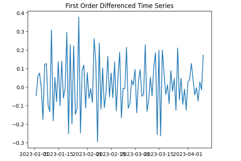
✅ 65. What is Differencing in Time Series Analysis?
Differencing is used to make a time series stationary by removing trends or seasonality.
First-order differencing
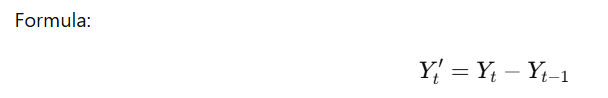
Purpose
- Remove trend
- Remove seasonality
- Stabilize mean/variance
Python Code
diff_values = values.diff().dropna()

plt.plot(diff_values)
plt.title('First Order Differenced Time Series')
plt.show()
✅ 66. Explain the Concept of Lag in Time Series
A lag is a previous value of a time series, shifted by k time steps.
Lag k means:
Why Lags Are Used
- Identify temporal dependencies
- Build features for ML forecasting (lag features)
- Compute autocorrelation (ACF)
- Create AR, MA, ARIMA models
Example Code
df = pd.DataFrame({
    'Original': values,
    'Lag_1': values.shift(1)
})

print(df.head())
Original Lag_1 2023-01-01 0.093207 NaN 2023-01-02 0.047461 0.093207 2023-01-03 0.100728 0.047461 2023-01-04 0.175987 0.100728 2023-01-05 0.173559 0.175987
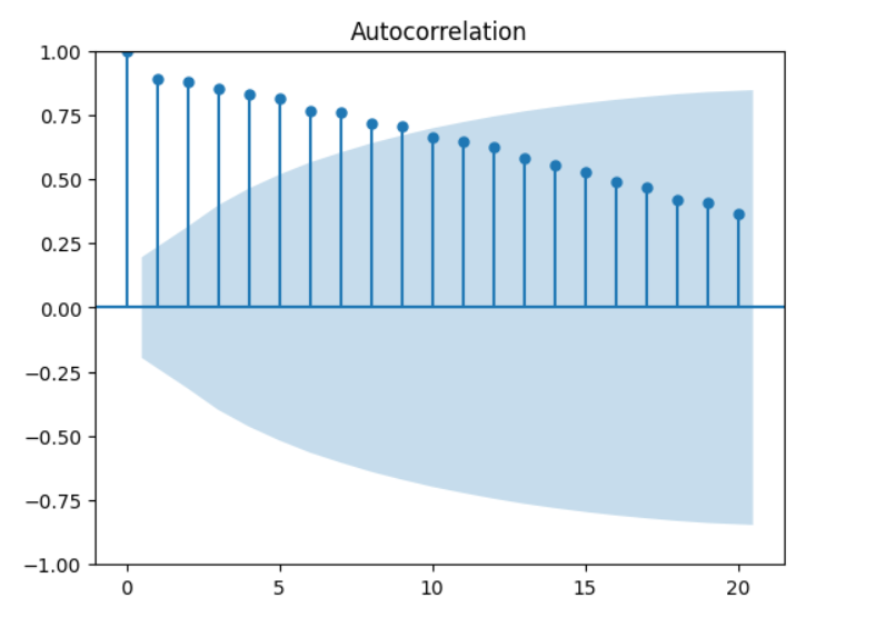
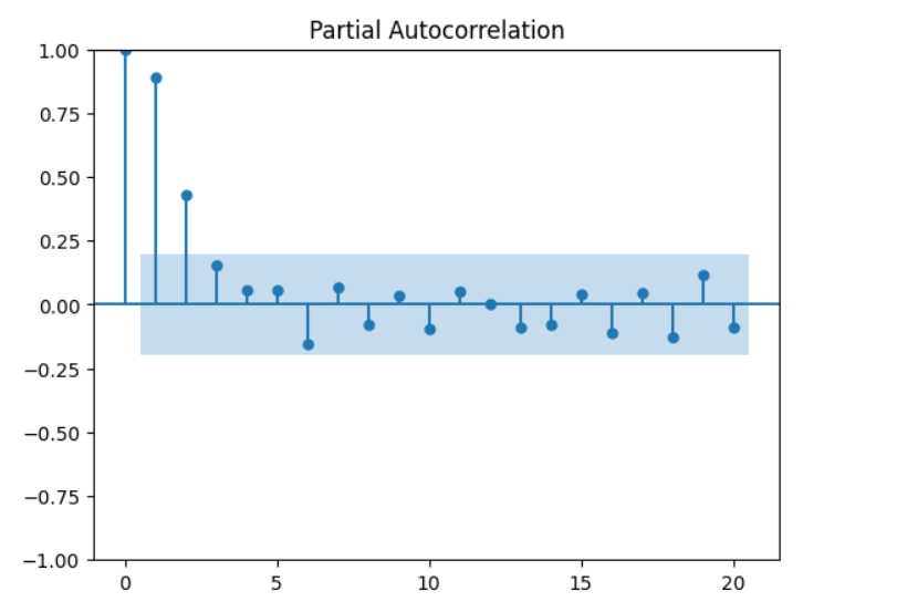
✅ 67. What is the Purpose of Autocorrelation and Partial Autocorrelation Plots?
ACF and PACF help determine ARIMA model parameters.
📌 Autocorrelation Function (ACF)
- Shows correlation between a value and its lagged values.
- Identifies MA(q) component.
- Spikes in ACF → significant lags.
📌 Partial Autocorrelation Function (PACF)
- Shows direct correlation after removing intermediate lags.
- Identifies AR(p) component.
Python Code
from statsmodels.graphics.tsaplots import plot_acf, plot_pacf
import matplotlib.pyplot as plt

plot_acf(values, lags=20)
plt.show()

plot_pacf(values, lags=20)
plt.show()
✅ 68. Describe the Box-Jenkins Methodology
A structured approach for building ARIMA/SARIMA models.
1. Model Identification
- Use ACF/PACF
- Determine differencing d for stationarity
- Identify AR(p) and MA(q)
2. Parameter Estimation
- Fit ARIMA using maximum likelihood estimation (MLE)
3. Diagnostic Checking
Residuals should:
- Be random (white noise)
- No autocorrelation
- Be normally distributed
4. Forecasting
After model validation, predict future values.
Python Example (ARIMA using SARIMAX)
from statsmodels.tsa.statespace.sarimax import SARIMAX
import matplotlib.pyplot as plt
model = SARIMAX(values, order=(1,1,1))
results = model.fit(disp=False)
print(results.summary())
# Forecast next 10 steps
forecast = results.get_forecast(steps=10)
pred_ci = forecast.conf_int()
predictions = forecast.predicted_mean
plt.figure(figsize=(10,5))
plt.plot(values.index, values, label='Observed')
plt.plot(predictions.index, predictions, label='Forecast')
plt.fill_between(pred_ci.index, pred_ci.iloc[:,0], pred_ci.iloc[:,1], alpha=0.2)
plt.legend()
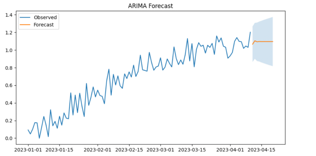
plt.title("ARIMA Forecast")
plt.show() SARIMAX Results
==============================================================================
Dep. Variable: y No. Observations: 100
Model: SARIMAX(1, 1, 1) Log Likelihood 84.214
Date: Tue, 09 Dec 2025 AIC -162.429
Time: 11:31:05 BIC -154.643
Sample: 01-01-2023 HQIC -159.279
- 04-10-2023
Covariance Type: opg
==============================================================================
coef std err z P>|z| [0.025 0.975]
------------------------------------------------------------------------------
ar.L1 -0.2834 0.125 -2.271 0.023 -0.528 -0.039
ma.L1 -0.5781 0.129 -4.481 0.000 -0.831 -0.325
sigma2 0.0106 0.001 7.805 0.000 0.008 0.013
===================================================================================
Ljung-Box (L1) (Q): 1.51 Jarque-Bera (JB): 3.90
Prob(Q): 0.22 Prob(JB): 0.14
Heteroskedasticity (H): 0.78 Skew: 0.48
Prob(H) (two-sided): 0.48 Kurtosis: 3.09
===================================================================================
Warnings:
[1] Covariance matrix calculated using the outer product of gradients (complex-step).
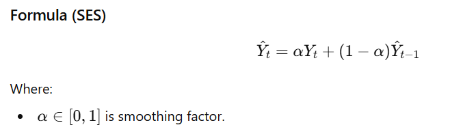
✅ 69. What is Exponential Smoothing?
A technique that applies exponentially decreasing weights to past observations.
Recent data → higher weight
Older data → lower weight
Types
- Simple Exponential Smoothing (SES)
For data with no trend, no seasonality. - Holt’s Linear Trend
Handles trend. - Holt–Winters’ Seasonal Method
Handles trend + seasonality (additive or multiplicative).
Python Code
from statsmodels.tsa.holtwinters import SimpleExpSmoothing
import matplotlib.pyplot as plt

model = SimpleExpSmoothing(values)
fit = model.fit(smoothing_level=0.2, optimized=False)

fitted_values = fit.fittedvalues

plt.plot(values, label='Actual')
plt.plot(fitted_values, label='Smoothed')
plt.legend()
plt.title('Exponential Smoothing')
plt.show()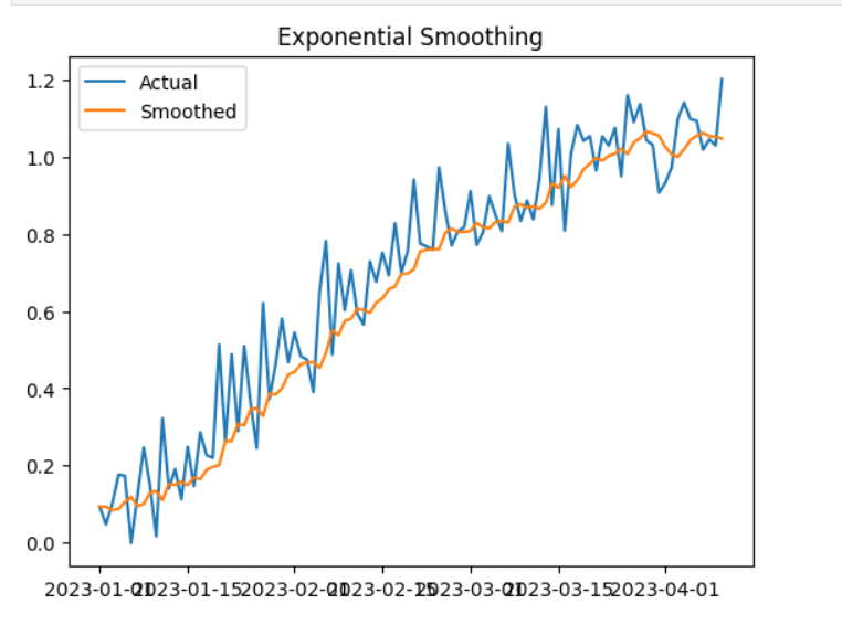
✅ 70. How Do You Evaluate the Accuracy of a Time Series Model?
Several common evaluation metrics:
1. MAE – Mean Absolute Error
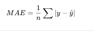
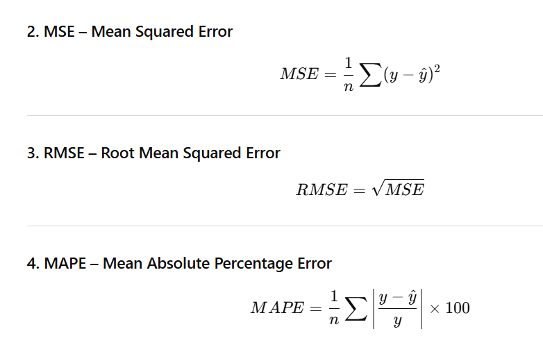
✅ Example
import pandas as pd
import numpy as np
from statsmodels.tsa.arima.model import ARIMA
from sklearn.metrics import mean_absolute_error, mean_squared_error

# Assume values is your time series
data = values.copy()

# 1. Train-test split
train_size = int(len(data) * 0.8)
train, test = data[:train_size], data[train_size:]

# 2. Fit ARIMA model
model = ARIMA(train, order=(1,1,1))
model_fit = model.fit()

# 3. Predict for length of test set
predicted = model_fit.forecast(steps=len(test))

# 4. Evaluation metrics
mae = mean_absolute_error(test, predicted)
mse = mean_squared_error(test, predicted)
rmse = np.sqrt(mse)
mape = np.mean(np.abs((test - predicted) / test)) * 100

print(f"MAE: {mae:.2f}")
print(f"MSE: {mse:.2f}")
print(f"RMSE: {rmse:.2f}")
print(f"MAPE: {mape:.2f}%")
output:
MAE: 0.07
MSE: 0.01
RMSE: 0.09
MAPE: 6.53%
📌 Optional: Plot Actual vs Predicted
import matplotlib.pyplot as plt

plt.figure(figsize=(10,5))
plt.plot(test.index, test, label='Actual')
plt.plot(test.index, predicted, label='Predicted')
plt.legend()
plt.title("Actual vs Predicted")
plt.show()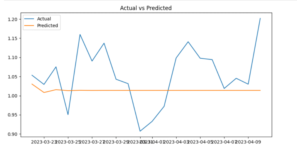
✅ 71. What is Bayesian Inference?
Bayesian inference is a statistical method that updates the probability of a hypothesis (parameter) as new evidence or data becomes available.
It is based on Bayes’ Theorem, which reverses conditional probability:
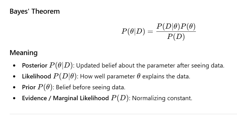
Key Idea
Bayesian inference does not give a single estimate.
Instead, it gives a distribution of possible values with uncertainties.
Example output:
“θ is likely between 0.3 and 0.6 with 95% probability.”
✅ 72. Define Prior, Likelihood, and Posterior
| Term | Description |
|---|---|
| Prior P(θ)P(\theta)P(θ) | Distribution expressing beliefs about a parameter before seeing data. |
| Likelihood (P(D | \theta)) |
| Posterior (P(\theta | D)) |
These three components form the backbone of Bayesian inference.
✅ 73. How Does Bayesian Statistics Differ from Frequentist Statistics?
| Aspect | Frequentist | Bayesian |
|---|---|---|
| Parameter View | Fixed but unknown | Random variable with distribution |
| Probability | Long-run frequency | Degree of belief |
| Goal | Point estimate (e.g., MLE) | Posterior distribution |
| Uncertainty | Confidence intervals | Credible intervals |
| Use of Prior | No prior used | Prior always used |
| Interpretation | Population-based | Belief-based |
Example Analogy
- Frequentist:
“If we repeat the experiment many times, 95% of the confidence intervals will contain the true value.” - Bayesian:
“Given the data, there is a 95% probability the true value lies inside this credible interval.”
✅ 74. What is a Conjugate Prior?
A conjugate prior is a prior distribution that, when combined with a likelihood, results in a posterior from the same distribution family.
This allows closed-form Bayesian updating.
Examples
| Likelihood | Conjugate Prior | Posterior |
|---|---|---|
| Binomial | Beta | Beta |
| Normal (σ² known) | Normal | Normal |
| Poisson | Gamma | Gamma |
Example: Coin Flips (Binomial + Beta)
from scipy.stats import beta, binom

# Prior: Beta(2, 2)
a_prior, b_prior = 2, 2

# Observed data: 6 heads out of 10 flips
heads, trials = 6, 10

# Posterior: Beta(alpha + heads, beta + failures)
a_post, b_post = a_prior + heads, b_prior + (trials - heads)

print(f"Posterior: Beta({a_post}, {b_post})")
Posterior: Beta(8, 6)
Posterior = Beta(8, 6)
→ Updated belief after seeing evidence.
✅ 75. Explain the Concept of Markov Chain Monte Carlo (MCMC)
MCMC is a class of algorithms used to sample from complex probability distributions, especially when the posterior cannot be computed analytically.
Why do we need MCMC?
- Posteriors are often high-dimensional
- Priors and likelihoods may be non-conjugate
- Posterior integrals cannot be solved analytically
Key Idea
- Build a Markov chain whose equilibrium distribution = target posterior
- After enough steps (burn-in), samples represent the true posterior
Common MCMC Algorithms
✔ 1. Metropolis–Hastings
- Propose a new sample.
- Accept/reject based on acceptance ratio.
✔ 2. Gibbs Sampling
- Sample each variable from its conditional distribution.
- Works when conditional distributions are known.
What MCMC Produces
A set of samples that approximate the posterior:
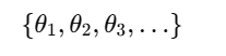
From these samples, we can compute:
- Mean parameter values
- Credible intervals
- Posterior predictive distributions
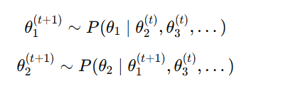
✅ 76. What is the Purpose of the Gibbs Sampling Algorithm?
Gibbs Sampling is an MCMC algorithm used to generate samples from a joint posterior distribution when direct sampling is difficult.
Purpose
To sample from a multivariate posterior by repeatedly sampling one parameter at a time from its conditional distribution
When to Use
- Joint distribution is hard to sample
- Conditional distributions are known & easy to sample
- Works very well when distributions are conjugate
Pros
- Efficient in high-dimensional models
- No proposal tuning needed (unlike Metropolis-Hastings)
- Often faster mixing when parameters are conditionally independent
Cons
- Slow if variables are highly correlated
- Requires closed-form conditional distributions
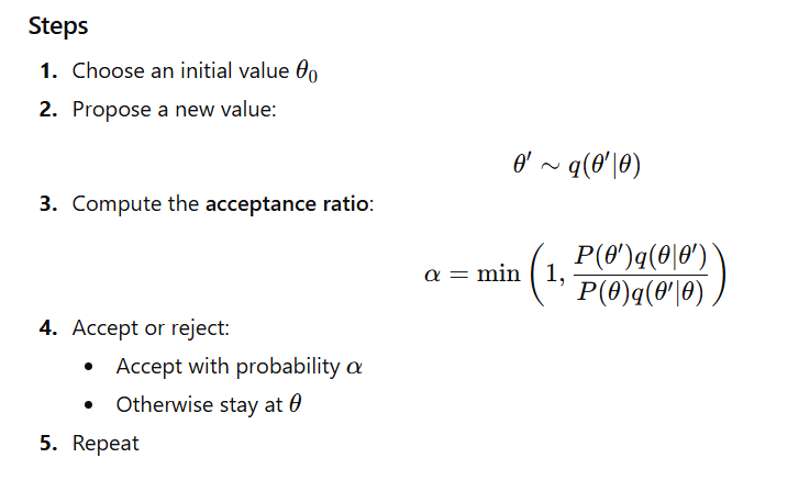
✅ 77. Describe the Metropolis–Hastings Algorithm
Metropolis–Hastings is a general-purpose MCMC algorithm used to sample from complex posterior distributions.
Python Example (Sampling from N(0,1))
import numpy as np
from scipy.stats import norm

def metropolis_hastings(log_posterior, n_samples=1000):
    theta = 0
    samples = [theta]

    for _ in range(n_samples):
        theta_proposal = norm.rvs(theta, 1)

        log_p_current = log_posterior(theta)
        log_p_proposal = log_posterior(theta_proposal)

        ratio = np.exp(log_p_proposal - log_p_current)

        if np.random.rand() < ratio:
            theta = theta_proposal

        samples.append(theta)

    return samples

# Example: N(0,1)
log_posterior = lambda x: -0.5 * x**2
samples = metropolis_hastings(log_posterior, n_samples=5000)
Visualization (from prompt):
- Histogram of MH samples
- True N(0,1) curve
✅ 78. What Are Credible Intervals in Bayesian Statistics?
A credible interval is a range of values within which a parameter lies with a given probability, based on its posterior distribution.
Example:
“A 95% credible interval means there is a 95% probability that the true parameter lies within this interval.”
Types
- Highest Posterior Density (HPD)
Shortest interval containing 95% of posterior mass. - Equal-tailed Interval
Removes 2.5% from both tails of the posterior.
Python Example (HPD using ArviZ)
import arviz as az
import numpy as np

posterior_samples = np.random.normal(0, 1, size=10000)
hpd_interval = az.hdi(posterior_samples, hdi_prob=0.95)

print("95% HPD Interval:", hpd_interval)
✅ 79. How Is Bayesian Updating Performed?
Bayesian updating means sequentially updating beliefs (posterior) as new data arrives.
Process
- Start with a prior
- Observe data → compute posterior
- Posterior becomes the new prior
- Repeat when new data comes
This is used in:
- Machine learning
- Online learning
- Real-time parameter estimation
Example: Updating a Beta Prior for Coin Flips
from scipy.stats import beta

a, b = 1, 1  # Beta(1,1) prior

for flip in ['H', 'T', 'H', 'H']:
    print(f"Before flip '{flip}': Beta({a}, {b})")

    if flip == 'H':
        a += 1
    else:
        b += 1

    print(f"After flip '{flip}': Beta({a}, {b})\n")
Each flip updates the posterior incrementally — this is Bayesian learning.
✅ 80. Provide a Real-World Application of Bayesian Methods
Application: Medical Diagnosis & Disease Probability
Bayesian reasoning helps interpret test results considering base rates (prevalence).
Let:
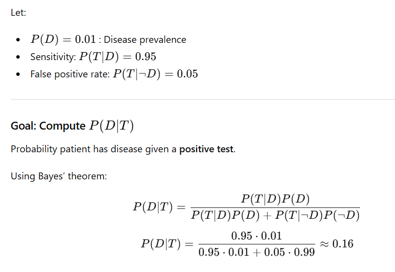
Interpretation
Even with a 95% accurate test, the true chance of having the disease is only ~16% after a positive result.
Reason: Low prevalence (base rate fallacy).
✅ 81. How Do You Choose the Appropriate Chart for Data Visualization?
Choosing the correct chart depends on:
1. Type of Data
- Categorical → Bar/ Pie
- Numerical → Histogram/ Boxplot
- Time series → Line chart
2. Purpose of Visualization
| Purpose | Best Charts |
|---|---|
| Comparison | Bar chart, Column chart, Line chart |
| Distribution | Histogram, Boxplot, KDE (density) plot |
| Relationship | Scatter plot, Bubble chart, Heatmap |
| Composition | Pie chart, Stacked bar chart, Area chart |
| Trend Over Time | Line chart, Area chart |
Examples
- Sales comparison → Bar chart
- Customer age distribution → Histogram or Boxplot
- Temperature over months → Line chart
✅ 82. Difference Between a Bar Chart and a Histogram
| Feature | Bar Chart | Histogram |
|---|---|---|
| Purpose | Compare categories | Show distribution of continuous data |
| X-axis | Categorical | Continuous (numeric bins) |
| Bars | Can be reordered | Cannot reorder (bins fixed) |
| Spacing | Bars separated | Bars touch each other |
Bar Chart Example
categories = ['A', 'B', 'C']
values = [3, 7, 4]
plt.bar(categories, values)
plt.title('Bar Chart')
plt.show()
Histogram Example
data = np.random.randn(1000)
plt.hist(data, bins=30, edgecolor='black')
plt.title('Histogram')
plt.show()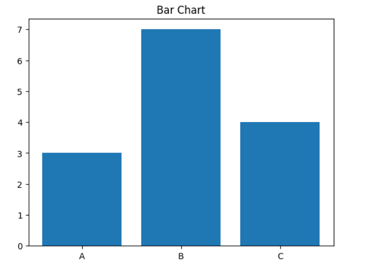
✅ 83. Use of Scatter Plots in Identifying Relationships
Scatter plots show the relationship between two continuous variables.
What You Can Identify
- Positive correlation → points go up-right
- Negative correlation → points go down-right
- No correlation → random cloud of points
- Outliers
- Clusters
Example
sns.scatterplot(x='total_bill', y='tip', data=tips)
plt.title('Tip vs Total Bill')
plt.show()
✅ 84. What is a Heatmap? When is it Useful?
A heatmap uses color to represent values in a matrix.
Useful For
- Correlation matrices
- Visualizing large numeric tables
- Understanding intensity across rows × columns
- Visualizing missing values (NaN heatmap)
Example: Correlation Heatmap
corr = iris.corr()
sns.heatmap(corr, annot=True, cmap='coolwarm')
plt.title('Correlation Heatmap')
plt.show()
✅ 85. How Do You Detect Outliers in a Dataset?
3 Common Methods
1️⃣ IQR METHOD (most common)
Outlier if:
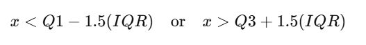
Outlier if:
Q1 = data['Values'].quantile(0.25)
Q3 = data['Values'].quantile(0.75)
IQR = Q3 - Q1

outliers = data[(data['Values'] < (Q1 - 1.5*IQR)) |
                (data['Values'] > (Q3 + 1.5*IQR))]

print(outliers)
2️⃣ Z-Score Method
Outlier if:
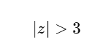
data['z'] = (data['Values'] - data['Values'].mean()) / data['Values'].std()
outliers = data[data['z'].abs() > 3]
3️⃣ Boxplot Visualization
plt.boxplot(data['Values'])
plt.title('Boxplot - Outlier Detection')
plt.show()
✅ 86. What is the Purpose of a Q-Q Plot?
A Q-Q plot (Quantile–Quantile plot) compares the quantiles of a dataset with the quantiles of a theoretical distribution (usually the normal distribution).
Purpose
- Check if data follows a specific distribution (normality test)
- Detect:
- Skewness
- Heavy tails
- Kurtosis issues
- Outliers
Interpretation
- Points on the straight line → data is approximately normal
- S-shaped curve → skewness
- Curved ends → heavy/light tails
- Extreme deviations → outliers
Code Example
import numpy as np
import statsmodels.graphics.gofplots as smg
import matplotlib.pyplot as plt

# Generate skewed data
data = np.random.exponential(size=100)

smg.qqplot(data, line='s')
plt.title('Q-Q Plot - Checking Normality')
plt.show()
✅ 87. Importance of Data Normalization
Normalization rescales values to a fixed range, usually [0, 1].
Why It Is Important
- Models like KNN, SVM, Logistic Regression, Neural Networks are sensitive to feature scale
- Prevents one feature from dominating others
- Improves gradient descent convergence speed
- Helps distance-based algorithms work correctly
Example
from sklearn.preprocessing import MinMaxScaler
import numpy as np

data = np.array([[1], [2], [3], [10]])
scaler = MinMaxScaler()

normalized = scaler.fit_transform(data)
print("Normalized Data:\n", normalized)
✅ 88. Difference Between Normalization and Standardization
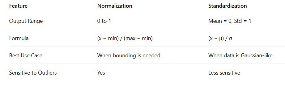
Code Example
from sklearn.preprocessing import StandardScaler

standardized = StandardScaler().fit_transform(data)
print("Standardized Data:\n", standardized)
✅ 89. How Do You Handle Missing Data?
Common Strategies
✔ 1. Remove Missing Data
- Drop rows →
df.dropna() - Drop columns with too many missing values
✔ 2. Impute Missing Values
- Mean/Median for numerical data
- Mode for categorical data
- Regression / ML-based imputation
- KNN imputation
- Interpolation for time-series
Code Example
import pandas as pd
import numpy as np

df = pd.DataFrame({
    'A': [1, 2, np.nan],
    'B': [5, np.nan, np.nan],
    'C': [1, 2, 3]
})

# Drop rows with any NaN
df_dropped = df.dropna()
print("After dropping rows:\n", df_dropped)

# Impute with mean
df_imputed = df.fillna(df.mean(numeric_only=True))
print("After imputing with mean:\n", df_imputed)
✅ 90. Implications of Imbalanced Datasets
An imbalanced dataset means one class has many more samples than another (e.g., fraud detection, medical diagnoses).
Problems
- Model becomes biased toward majority class
- High accuracy but poor minority detection
- Fails on rare but important events
Solutions
✔ 1. Resampling
- Oversampling minority class (e.g., SMOTE)
- Undersampling majority class
✔ 2. Class Weights
- Give higher penalty to minority class misclassification
✔ 3. Use Better Metrics
- Precision
- Recall
- F1-score
- ROC-AUC
Example (Class-Weighted Logistic Regression)
from sklearn.linear_model import LogisticRegression
from sklearn.model_selection import train_test_split
from sklearn.metrics import classification_report
from imblearn.datasets import make_imbalance
from sklearn.datasets import make_classification

# Create synthetic imbalanced dataset
X, y = make_classification(
    n_samples=1000, n_features=20, n_informative=15,
    n_redundant=5, random_state=42
)

X, y = make_imbalance(X, y, sampling_strategy={0: 900, 1: 100}, random_state=42)

X_train, X_test, y_train, y_test = train_test_split(X, y, test_size=0.3, random_state=42)

model = LogisticRegression(class_weight='balanced')
model.fit(X_train, y_train)

pred = model.predict(X_test)
print(classification_report(y_test, pred))
✅ 91. How Would You Design an A/B Test for a New Website Feature?
An A/B test compares two versions (A = control, B = treatment) to see which performs better.
Steps to Design an A/B Test
- Define the Objective
Example: Increase sign-ups by 10%. - Formulate Hypothesis
- H₀: No difference between A and B
- H₁: B improves conversion rate
- Choose Metrics
- Primary metric: conversion rate
- Secondary: CTR, bounce rate, session duration
- Random Assignment
Randomly split users into A and B to avoid bias. - Calculate Sample Size
Use statistical power analysis. - Run the Test
Ensure:- Test duration is sufficient
- No overlapping experiments
- Stable traffic
- Analyze Results
- Use z-test, t-test, or chi-square
- Check confidence intervals
- Ensure practical + statistical significance
Python Example
from statsmodels.stats.power import zt_ind_solve_power
import numpy as np

baseline_rate = 0.05
desired_improvement = 0.01  # 1%

effect_size = desired_improvement / np.sqrt(baseline_rate * (1 - baseline_rate))

required_sample = zt_ind_solve_power(
    effect_size=effect_size, alpha=0.05, power=0.8, ratio=1
)

print(f"Required sample per group: {int(required_sample)}")
✅ 92. What Metrics Would You Consider to Evaluate an A/B Test?
| Metric | Purpose |
|---|---|
| Conversion Rate | Main success metric (sign-ups, purchases) |
| CTR | Measures click engagement |
| Average Time on Page | Indicates engagement depth |
| Revenue per User | Measures monetary effect |
| Bounce Rate | Shows user dissatisfaction |
| Retention Rate | Long-term user behavior |
Important
- Choose one primary metric
- Use secondary metrics to detect unexpected negative effects
✅ 93. How Do You Handle Confounding Variables in an Experiment?
A confounder affects both the treatment and the outcome → makes the results unreliable.
Ways to Handle Confounders
- Randomization
Random assignment distributes confounders evenly. - Stratification
Example: Split users by age group before randomizing. - Covariate Adjustment
Add confounders to a regression model. - Matched Pairing
Pair users with similar characteristics (age, gender, traffic source). - Use Control Groups
To isolate the effect of the new feature.
Example: Control for Age
import pandas as pd
import statsmodels.api as sm
import numpy as np

df = pd.DataFrame({
    'group': ['A', 'B'] * 50,
    'age': np.random.randint(18, 65, 100),
    'converted': np.random.choice([0, 1], p=[0.9, 0.1], size=100)
})

X = sm.add_constant(df[['group', 'age']])
y = df['converted']

model = sm.Logit(y, X).fit()
print(model.summary())
✅ 94. Describe a Situation Where You Had to Choose Between Precision and Recall
Example: Fraud Detection
- Recall is more important
→ We must catch as many fraud cases as possible
→ Even if false positives increase
Why?
- Missing a fraudulent transaction (false negative) is very costly
- Flagging a legitimate user (false positive) is less costly
Trade-off
- High precision + low recall → detect few frauds
- High recall + lower precision → detect most frauds, but more false alerts
Balanced Metric
Use F1-score when both matter.
✅ 95. How Do You Assess the Performance of a Classification Model?
Common Evaluation Metrics
| Metric | Meaning |
|---|---|
| Accuracy | % of correct predictions (bad for imbalanced data) |
| Precision | TP / (TP + FP) – correctness of positive predictions |
| Recall | TP / (TP + FN) – how many actual positives detected |
| F1-score | Harmonic mean of precision & recall |
| ROC-AUC | Ability to separate classes at all thresholds |
| Log Loss | Penalizes confident but wrong predictions |
Code Example
from sklearn.metrics import classification_report, roc_auc_score

y_true = [1, 0, 1, 1, 0, 1]
y_pred = [1, 0, 1, 0, 0, 1]

print(classification_report(y_true, y_pred))
print("ROC-AUC:", roc_auc_score(y_true, y_pred))
✅ 96. What is a Confusion Matrix? How Is It Interpreted?
A confusion matrix is a table used to evaluate the performance of a classification model.
It shows the number of:
| Actual \ Predicted | Positive | Negative |
|---|---|---|
| Positive | TP | FN |
| Negative | FP | TN |
🔹 Interpretation
- TP (True Positive): Model correctly predicts positive class
- TN (True Negative): Model correctly predicts negative class
- FP (False Positive): Model predicts positive but it is actually negative (Type I error)
- FN (False Negative): Model predicts negative but it is actually positive (Type II error)
Code:
from sklearn.metrics import confusion_matrix

cm = confusion_matrix(y_true, y_pred)
print("Confusion Matrix:\n", cm)
✅ 97. Explain Precision, Recall, and F1-Score
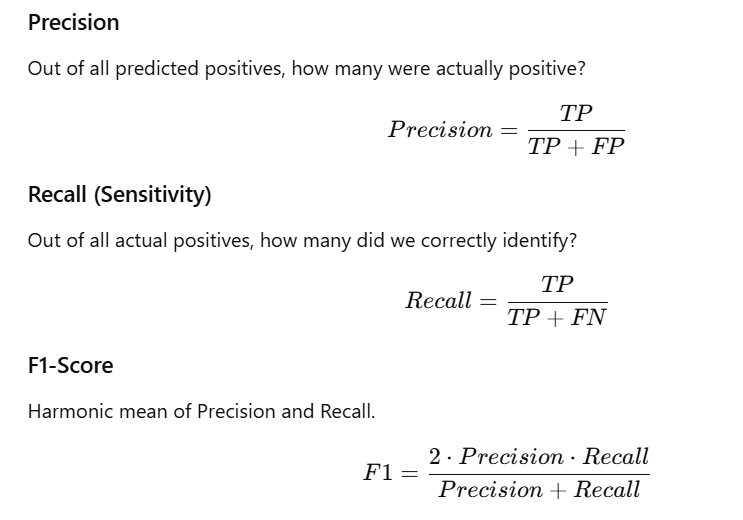
Code:
from sklearn.metrics import precision_score, recall_score, f1_score

print("Precision:", precision_score(y_true, y_pred))
print("Recall:", recall_score(y_true, y_pred))
print("F1 Score:", f1_score(y_true, y_pred))
✅ 98. How Do You Handle Multicollinearity in Regression?
Multicollinearity occurs when independent variables are highly correlated.
This makes coefficient estimates unstable and unreliable.
🔍 How to Detect:
- Correlation matrix
- Variance Inflation Factor (VIF)
- VIF > 5 or 10 = high multicollinearity
🛠️ How to Fix:
- Remove one of the correlated features
- Use regularization (Ridge or Lasso)
- Combine correlated variables using PCA
- Domain-specific feature engineering
Code:
from statsmodels.stats.outliers_influence import variance_inflation_factor
import pandas as pd

vif_data = pd.DataFrame()
vif_data["feature"] = df.columns
vif_data["VIF"] = [variance_inflation_factor(df.values, i) for i in range(df.shape[1])]

print(vif_data)
✅ 99. Describe a Time When You Cleaned a Messy Dataset
Scenario:
You receive customer feedback data with:
- Missing values
- Duplicates
- Inconsistent text
- Extra spaces
- Mixed data types
Steps You Took:
- Load and inspect dataset
- Handle missing values
- Remove duplicate rows
- Standardize text (strip, lowercase)
- Convert columns to numeric
- Create new features (e.g., length of feedback)
Code:
import pandas as pd

df = pd.read_csv('messy_data.csv')

df.drop_duplicates(inplace=True)

df.fillna({'feedback': ''}, inplace=True)

df['feedback'] = df['feedback'].str.strip().str.lower()

df['rating'] = pd.to_numeric(df['rating'], errors='coerce')

print(df.head())
✅ 100. How Do You Communicate Statistical Findings to Non-Technical Stakeholders?
🔑 Best Practices:
- Tell a clear story that connects data to business impact
- Use visuals (bar charts, line charts) instead of raw tables
- Avoid jargon — use simple language
- Focus on insights, not equations
- Provide recommendations, not just metrics
Example:
❌ Technical Explanation:
“Variant B has a statistically significant improvement in CTR (p < 0.05).”
✔ Business-friendly Explanation:
“Variant B increased click-through rate by 10%. If applied to all users, this could significantly increase engagement.”